A few weeks ago, Twitter announced that they were releasing a client for their Streaming API. It’s open-source! Get it here: https://github.com/twitter/hbc

This is pretty great news, for a few reasons:

  1. The Streaming API relies on a consistent connection, so doing all that messy authentication and making sure you’re not going to drop any information is simplified and will comport to Twitter specs.
  2. Twitter is deprecating v1 of their APIs, including Streaming and RESTful. They haven’t made any dramatic changes in the Streaming API but it still means changing libraries or expecting someone who is maintaining your library of choice to update it.
  3. It’s all being developed and actively maintained in-house by Twitter. The maintainers, @steven and @kevino (apparently one of the perks of working at Twitter is getting an awesome username), are especially responsive with bug fixes and pull requests.
  4. There’s a plugin for the Twitter4j library, if you want to implement listeners that do any background data handling or parsing for particular pieces of data (deletes vs. stall_warnings). I haven’t tried this yet but it looks promising.

The downside? It’s in Java. While this used to be a nice insult when I was hacking around in CS 180 and Java was at version 1.4.2, Java has gotten much faster since then. The addition of projects like Apache Maven has made development with dependencies and handling classpaths much easier. But then, you still have to know at least a little Java to get the thing up and running.

I’ve been using this as my primary gardenhose collection device for a few weeks now with only a handful of issues, as bugs are surfacing in development but being squashed soon after.

Wow, last week’s Drag Race post made the rounds in the stats and Drag Race circles. It was cross-posted to Jezebel and has been getting some pretty high-profile links. A little birdy told me that Ms. Ru herself has read it. I think I can die a happy man knowing that RuPaul has visited Bad Hessian.

Anyhow, last week I tried to count Coco out. I was reading her like the latest AJS. The library is open. But her response to me was simple — girl, please:

(Also this happened. Wig under a wig.)


(both of these gifs courtesy of f%^@yeahdragrace)

Can that win safeguard Coco from getting eliminated? Let’s look at the numbers after the jump.
Continue reading

lipsync_header-ed

If you follow me on Twitter, you know that I’m a big fan of RuPaul’s Drag Race. The transformation, the glamour, the sheer eleganza extravanga is something my life needs to interrupt the monotony of grad school. I was able to catch up on nearly four seasons in a little less than a month, and I’ve been watching the current (fifth) season religiously every Monday at Plan B, the gay bar across from my house.

I don’t know if this occurs with other reality shows (this is the first I’ve been taken with), but there is some element of prediction involved in knowing who will come out as the winner. A drag queen we spoke with at Plan B suggested that the length of time each queen appears in the season preview is an indicator, while Homoviper’s “index” is largely based on a more qualitative, hermeneutic analysis. I figured, hey, we could probably build a statistical model to know which factors are the most determinative in winning the competition.
Continue reading

The quote above comes from Firebaugh and Gibbs’s “User’s Guide to Ratio Variables” (1985: 718). I first ran across this article a couple of years ago but only just got around to reading it this past week. This article, along with a couple of companion pieces (Firebaugh and Gibbs 1986; Firebaugh 1988), helped to redefine what was, at that point, a nearly century-old debate dating back to an 1897 article by Karl Pearson on ratio variables and the problem of spurious correlation. The gist of “Pearson’s Paradox” is that “two ratios can be correlated even when their components are not—for example, X/Z and Y/Z can be correlated even when X, Y, and Z are not” (Firebaugh 1988: 524).* This basic fact became a point of contention among methodologists interested in, among other things, the best approach to controlling for population size when analyzing aggregate data in which the magnitude of a given outcome is at least partially driven by the size of the underlying units. While the debate itself is pretty interesting, the thing I liked best about the Firebaugh and Gibbs piece is the way in which the authors managed to clear away a significant amount of methodological underbrush using simple math.

Following Firebaugh and Gibbs (1986: 103), let’s start with a component-based model in which y is a continuous outcome, x is the predictor of interest, z is a control representing the size of the population, and \eta represents a random disturbance:

    \[ y = \beta_0 + \beta_1{x} + \beta_2{z} + \eta. \]

If we then divide everything through by z we end up with an equivalent ratio-based model:

    \[ \frac{y}{z} = \beta_0{\left(\frac{1}{z}\right)} + \beta_1{\left(\frac{x}{z}\right)} + \beta_2 + \varepsilon, \]

where \varepsilon = \eta/z. On its face, the equivalence of these two expressions seems obvious. Yet prior to the work of Firebaugh and Gibbs, much of the fight was over the difference between the component-based model described above and the following:

    \[ \frac{y}{z} = \beta^*_1{\left(\frac{x}{z}\right)} + \beta^*_2 + \varepsilon^*. \]

Simply put, the fight was driven by an attempt to adjudicate between fundamentally non-comparable models, hence the reference in the title to wasted journal space, confused readers, and solutions to phantom problems.

What Firebaugh and Gibbs ultimately show is that when we compare the component method to the equivalent ratio method (i.e. when we make the correct comparison), we find alternative estimators for the same basic model. To the extent that \sigma^2—the variance of \eta—is proportional to z^2 (i.e. to the extent that the variance of the error term is characterized by a particular form of population-related heteroscedasticity), the ratio method actually provides more efficient estimates of the parameters of interest than the corresponding component method (see Firebaugh and Gibbs 1986).** So where we once saw a potential problem, we now see a potential solution.

Even if you don’t care about ratio variables, I think that the original piece, subsequent follow ups, and exchanges with critics (namely Bradshaw and Radbill 1987) are well worth the read. This is a great example of someone thinking through the problem of model specification, as well as the implications of the often overlooked distinction between specification and estimation. There is also a serious discussion of the relationship between theory and method. More specifically, Firebaugh and Gibbs go to great lengths to emphasize that, by definition, our theoretical interests cannot help us decide between mathematically equivalent expressions. The trick, of course, is recognizing equivalent expressions when you see them.

* Firebaugh (1988: 524-526) shows that Pearson’s Paradox is a byproduct of the fact that correlation coefficients do not account for the value of the y-intercept. Pearson’s Paradox does not extend to the case of regression in which the intercept is explicitly taken into account.

** Nerdy readers may recognize the ratio method for what it is: a weighted least squares model.

Does anyone know a statistical test for telling me if I have an outlier within a set of spatial point data? It seems like someone should have invented said method in the 1960s and I just can’t find it through my googling. But I do read a fair bit of GIS and geostatistics literature, and I’ve never seen it. (Or, gasp, someone tried to do it and concluded it was intractable…) Guess I’ll have to make my own.

So here’s my situation: I have some point data – just normal latitude and longitude coordinates – with an associated covariate. Let’s call the covariate m for now. I want to draw a polygon around my points and argue that the resulting shape can be defined as the boundary of a neighborhood. Except I’m worried that there are really high, or really low, values of m near the border of the neighborhood, and thus my resulting polygons are potentially skewed toward/away from these “spatial outliers.”

As an illustration, imagine that a potato farmer wants to spray her field for aphids, but only wants to spray the affected areas. Logically, she decides to randomly sample 10 locations within her field; draw a polygon around the locations where she finds aphids; and then spray all the area inside the polygon (and none of the area outside the polygon). You could check out UC-Davis’s excellent website for potato pest management to confirm that this is not exactly the correct method, but it’s a reasonable approximation (although, their recommendation on sampling is radically different).

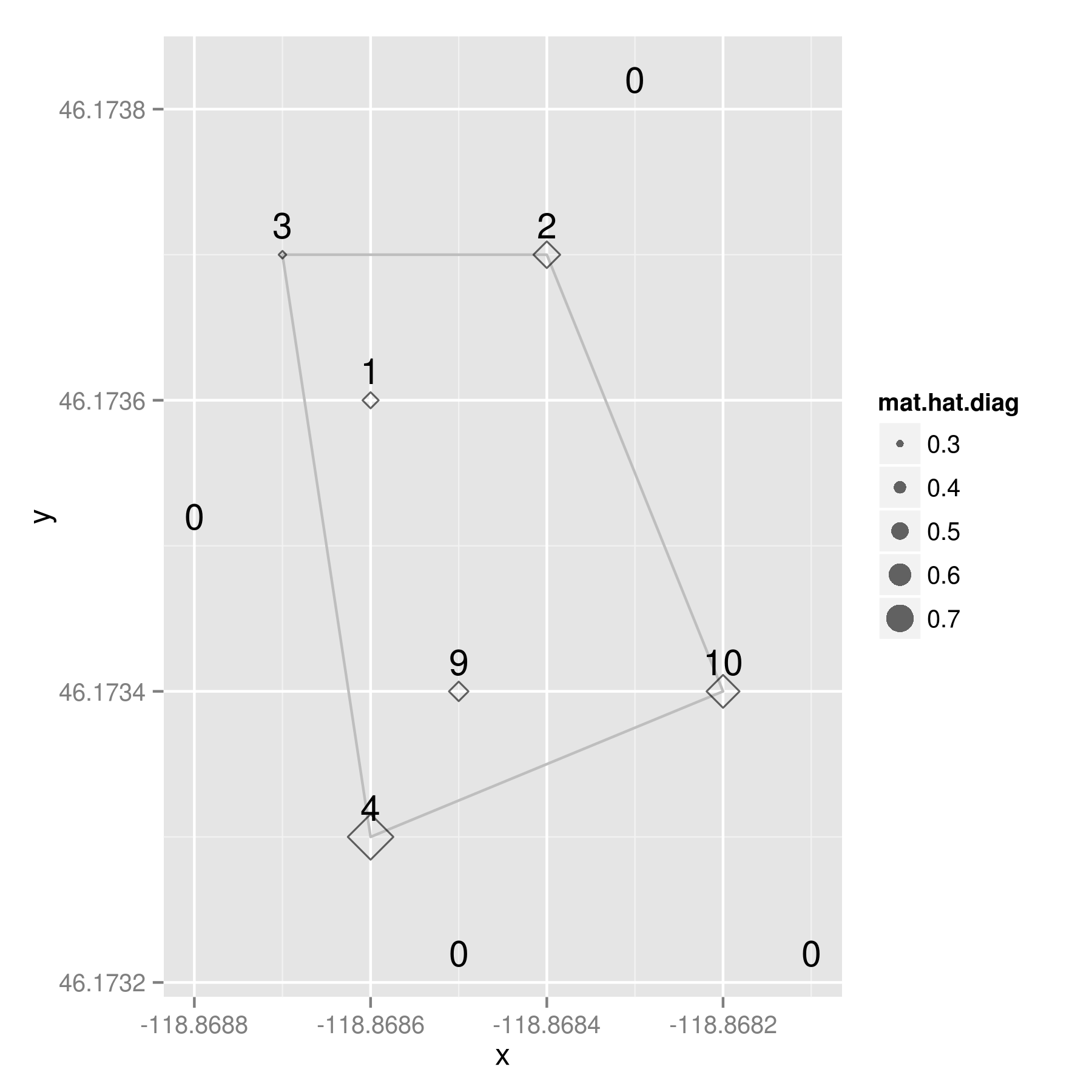
Our potato farmer might observe something like this. The labels are the aphid counts at each location. I’ll explain the diamond symbols in a moment….

potatoes

Remember that the “polygon of infestation” is drawn according to a presence/absence dichotomy, so the aphid count is the covariate in this situation. (And, yes, it has already occurred to me that everything I’m writing here might only apply to this special case where the polygon is based on a dichotomized version of an underlying count variable, m. But that additional complication is for future blogage….)

Here’s the data for those that want to play along at home:
i         x       y  m
1 -118.8682 46.1734 10
2 -118.8687 46.1737 3
3 -118.8683 46.1738 0
4 -118.8685 46.1732 0
5 -118.8688 46.1735 0
6 -118.8681 46.1732 0
7 -118.8686 46.1733 4
8 -118.8685 46.1734 9
9 -118.8684 46.1737 2
10 -118.8686 46.1736 1

I am trying to calculate the amount that any given point might be considered an outlier. Either an outlier in terms of the distribution of the covariate, a spatial outlier, or both. To me, this sounds like a perfect situation to calculate leverages via the hat matrix. You may remember from an intro regression course – or maybe you don’t, because sadly, regression is usually not taught from a matrix algebra point of view – that the hat matrix is a n X n square matrix of observations, which puts a hat on the observed Y variable:

y-hat = H * y

More importantly for my purposes, the diagonal elements of any hat matrix (usually denoted h_ii), indicate the amount of leverage that observation i has on y-hat. And even better for my purposes, I don’t need a Y variable to calculate a hat matrix because it’s composed entirely of the design matrix, and a few transformations there of:

H = X * ( t(X) * X )^{-1} * t(X)

where X is the n X p design matrix of n observations and p independent variables; and t(X) is the transpose of X, and X^{-1} is the usual inverse matrix.

My design matrix, X, has the latitude, longitude, and aphid counts from my potato example. When I calculate a hat matrix for it, the resulting values are indicators of leverage — both spatially and on the covariate. Now look back up there at that map. See those diamond shapes? They’re proportionally sized based on the value of the diagonal of the hat matrix (h_ii) for each observation. And what do we conclude from this little example?

By looking at the raw aphid counts, our potato farmer may have been tempted to enlarge the spraying zone around the points with nine and 10 aphids — they seem like rather high values and they’re both kind of near the edge of the polygon. However, the most “outlierly” observation in her sample was the spot with four aphids located at the southwest corner of the polygon.
It has a hat value of .792488, a good bit larger than the location with 10 aphids, which had a hat value of 0.615336.

At this point, a good geostatistician could probably come up with a measure of significance to go along with my hat values, but I’m not a geostatistician – good or otherwise. I just Monte Carlo-ed the values a bit and concluded…. given this arrangement of sample points *with aphids,* about 11% of the time we would see a hat value equal to or above .792488. If we use the standard alpha level of .05 found in most social science publications, our potato farmer would be forced to accept the null hypothesis that the observed aphid counts were drawn from a random distribution. I.e. there aren’t any outliers – beyond what we would expect from randomness – so she should trust the polygon as a good boundary of the zone of infestation. (Note my emphasis of “with aphids” in the conclusion. I could have Monte Carlo-ed the points with zero counts, but chose not to because, laziness. Not sure if that changes the conclusions…)

So? Two things: 1) I would love to find out that someone else invented a better method for detecting spatial outliers in point pattern data; and 2) hat matrices are really useful.

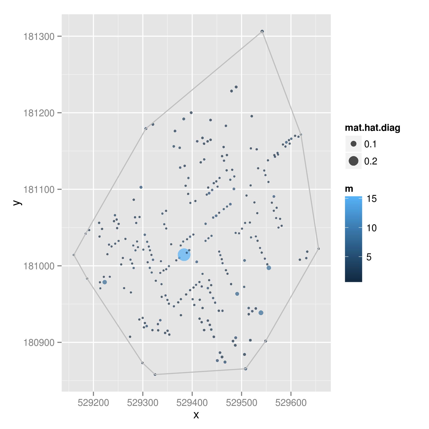
And because one dataset is never enough, I downloaded a version of John Snow’s cholera data that Robin Wilson digitized from the original maps. Same procedure here, except color indicates the number of deaths at each location and the dot circumference indicates the hat values.

cholera

That point in the middle had 15 deaths when most of the addresses had one or two deaths; this created a hat value of .28009. Given 1000 Monte Carlo trials, less than 2% of the draws showed a hat value higher than .28009. So even though this point looks to be quite close to the middle of the points, it is likely to be a spatial outlier – above and beyond what we would expect given randomness.

Comments? Suggestions for improvements? Pictures of John Snow wearing dapper hats?


Neal Caren of UNC Sociology has put out a call to forecast the number of NRA members in June 2013 using NRA publication subscriber data. Given that Neal’s interests elide with those of several Bad Hessian contributors and per my previous post on predictions in sociology, I took a stab using the forecast package for R. You can find the code I used here and my forecast can be found on scatterplot here.

raspberry-pi-top

A friend of mine has recently let me borrow a Raspberry Pi, a tiny, ultra-cheap computer that uses an SD card for a hard drive and uses a mini-USB cord for power. It runs either their Debian distro (Raspbian) or Arch without much trouble.

I’ve been thinking of cool things to do with it. There are a number of pretty cool projects that folks have done with a little bit of wiring and elbow grease. These are no doubt amazing and worthy of much geek admiration. I’ve been trying to think of something novel to do with mine. Matt and I thought we were on to something when we discussed a cat toy that would change direction when it hit a wall.

I put the little DC motor away when I realized that there’s probably some nifty social scientific data that can be had by a tiny computing device with a portable power source and USB wireless card. Asking Twitter about what one could do here, David Masad suggested replicating this study which estimates crowds using dropped wireless packets. A few other ideas I’ve had suggest that using an infrared sensor could count foot traffic in particular areas, sensors hooked up next to a door to get data on entering and leaving a room, or a sound monitor that collects data on voice interaction. Of course, some of these suggestions get dangerously close to violating individual privacy and disclosure, so the more that these sensors make people anonymous the better.

So, tossing this idea out to Bad Hessian readers — what would be some other “unobtrusive methods” that could be leveraged with a tiny computer and some simple sensors?

This is not a post about Nate Silver. I promise. One of the more interesting and well-covered stories of the 2012 US Elections was the so-called “quants vs. pundits” debate that focused–unfairly, given the excellent models developed by Sam Wang, Drew Linzer, and Simon Jackman–on Nate Silver’s Five Thirty Eight forecasting model. I follow a number of social scientists on Twitter and many of their reactions to the success of these models followed along the lines of “YEAH! SCIENCE!” and “+1 for the quants!” and so on. There seemed to be real joy (aside from the fact that many of these individuals were Obama supporters) in the growing public recognition that quantitative forecasting models can produce valid results.
Continue reading


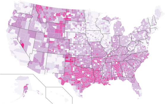
Signers to White House secession petitions by county. Color based on proportion of residents signing, with darker colors showing higher levels of secession support. Current as of 1am on Thurday, November 15th. Click here for an interactive version.

Since Election Day, more than 60 petitions have been posted on the White House’s website requesting that states be allowed to withdraw from the United States and create their own government. As of November 13, 2012, the following states had active petitions: Alabama, Alaska, Arizona, Arkansas, California, Colorado, Delaware, Florida, Georgia, Idaho, Illinois, Indiana, Kansas, Kentucky, Louisiana, Michigan, Minnesota, Mississippi, Missouri, Montana, Nebraska, Nevada, New Hampshire, New Jersey, New Mexico, New York, North Carolina, North Dakota, Ohio, Oklahoma, Oregon, Pennsylvania, Rhode Island, South Carolina, South Dakota, Tennessee, Texas, Utah, Virginia, Virginias, West Virginia, Wisconsin, and Wyoming.

While petitions are focused on particular states, signers can be from anywhere. In order to show where support for these secession was the strongest, a graduate seminar on collecting and analyzing and data from the web in the UNC Sociology Department downloaded the names and cities of each of the petition signers from the White House website, geocoded each of the locations, and plotted the results.

In total, we collected data on 764,387 signatures. Of these, we identified 270,610 unique combinations of names and places, suggesting that a large number of people were signing more than one petition. Approximately 90%, or 244,001, of these individuals provided valid city locations that we could locate with a US county.

The above graphic shows the distribution of these petition signers across the US. Colors are based proportion of people in each county who signed.

We also looked at the distribution of petition signers by gender. While petition signers did not list their gender, we attempted to match first names with Social Security data on the relative frequency of names by sex. Of the 242,823 respondents with gendered names, 62% had male names and 38% had female names. This 24 point gender gap is twice the size of the gender gap for voters in the 2012 Presidential election.

Tools: Python, Yahoo Geocoding API, and Pete Skomoroch’s remix of Nathan Yau’s county thematic map script.

Neal Caren, Ali Eshraghi, Sarah Gaby, Brandon Gorman, Michael Good, Jonathan Horowitz, Ali Kadivar, Rachel Ramsay, Charles Seguin, and Didem Turkoglu.

Note: This is a repost from the original at http://www.unc.edu/~ncaren/secessionists/ the map at the original site is interactive, but I’ve had trouble adding that functionality here. We reposted to make this Bad Hessians Official. Thanks to the Bad Hessians for having us on as guests.

As it turns out, logistic regression is much harder than it looks. Actually, the hard part is trying to compare the results of logistic regression across models. The basic gist of the problem is that the coefficients produced by a run-of-the-mill logistic regression are affected by the degree of unobserved heterogeneity in the model, thus making it difficult to discern real differences in the true effect of a given variable or set of variables from differences induced by changes in the degree of unobserved heterogeneity.

To see how this works, let’s imagine that the values of a given binary outcome y_i is driven by the following data generating process:

    \[ y^*_i = \alpha_0 + \alpha_1{x_{i1}} + \ldots + \alpha_J{x_{iJ}} + \sigma\epsilon_i, \]

where y^*_i refers to an unobserved latent variable ranging from -\infty to \infty which depicts the underlying propensity for a given event y_i to occur, \alpha_j represents the effect associated with the jth independent variable x_{ij}, and \sigma represents an adjustment factor which allows the variance of the error term \epsilon_i to be adjusted up or down.

Since y^*_i is unobservable, the latent variable model can’t be estimated directly. Instead, we take the latent variable model as a point of departure and treat y—which we can observe—as a binary indicator of whether or not the value of y^*_i is above a given threshold \tau. By convention, we typically assume that \tau = 0. If we further assume that \epsilon has a logistic distribution such that E(\epsilon|\mathbf{x}) = 0 and Var(\epsilon|\mathbf{x}) = \pi^2/3, we find with a little bit of work that

    \[ \text{ln}\left(\frac{\text{Pr}(y_i = 1)}{1-[\text{Pr}(y_i = 1)]}\right) = \beta_0 + \beta_1{x_{i1}} + \ldots + \beta_J{x_{iJ}}. \]

This should look familiar—it is the standard logistic regression model. If we had assumed \epsilon took on a normal distribution such that E(\epsilon|\mathbf{x}) = 0 and Var(\epsilon|\mathbf{x}) = 1, we would have ended up with a probit model. Consequently, anything I say here about the logistic regression applies to probit models as well.

The relationship between the set of “true” effects \alpha_j and the set of estimated effects \beta_j is as follows:

    \[ \beta_j = \alpha_j/\sigma \hspace{.5in} j = 1, \ldots, J. \]

Simply put, when we estimate an effect using logistic regression, we are actually estimating the ratio between the true effect and the degree of unobserved heterogeneity. We can think about this as a form of implicit standardization. The problem is that to the extent that the magnitude of \sigma varies across models, so does the metric according to which coefficients are standardized. What this means is that the magnitude of \beta_j can vary across models even when the the magnitude of the true effect \alpha_j remains constant.

The implication here is that we can’t get away with the usual trick of comparing a series of nested models to determine the way in which the inclusion of controls affects the parameter estimates associated with a given variable of interest. Moreover, we can’t compare group-specific models unless we are willing to assume groupwise homoscedasticity. The latter principle also extends to the interpretation of interaction effects within a single model. In other words, unobserved heterogeneity can pose big problems in the context of logistic regression.

Perhaps somewhat surprisingly, discussion of this issue goes back at least as far as Winship and Mare (1984) who proposed a solution based on the use of a standardized dependent variable. Alternative solutions have since been proposed by Allison (1999), Williams (2009), and, most recently, Karlson et al. who have a paper forthcoming in Sociological Methodology. In addition to providing a nice overview of this line of work, Mood (2010) discusses a number of other solutions including the use of linear probability models. While the linear probability model is not without its problems, it is easy to estimate and interpret. Moreover, the problems that does have are often easily remedied without turning to logistic regression.