If you’re looking for a good outlet for some computationally-oriented social science work, check out the International Conference on Computational Social Science (IC^2S^2). (Disclaimer: I am on the program committee for this conference). Last year, as the Computational Social Science Summit, the conference attracted 200 participants and had a very vibrant set of panels.

Abstracts are due on January 31, 2016. Hoping to see many of you there!

[Note: I do realize that this event was nearly two months ago. I have no one to blame but the academic job market.]

On August 15 and 16, we held the first annual ASA Datathon at the D-Lab at Berkeley. Nearly 25 people came from academia, industry, and government participated during the 24-hour hack session. The datathon focused on open city data and methods, and questions surrounded issues such as gentrification, transit, and urban change.

Two of our sponsors kicked off the event by giving some useful presentations on open city data and visualization tools. Mike Rosengarten from OpenGov presented on OpenGov’s incredibly detailed and descriptive tools for exploring municipal revenues and budgets. And Matt Sundquist from plot.ly showed off the platform’s interactive interface which works across multiple programming environments.

Fueled by various elements of caffeine and great food, six teams hacked away through the night and presented their work on the 16th at the Hilton San Francisco. Our excellent panel of judges picked the three top presentations which stood out the most:

Honorable mention: Spurious Correlations

The Spurious Correlations team developed a statistical definition for gentrification and attempted to define which zip codes had been gentrified by their definition. Curious about those doing the gentrifying, they asked if artists acted as “middle gentrifiers.” While this seemed to correlate in Minneapolis, it didn’t hold for San Francisco.

Second place: Team Vélo 

Team Vélo, as the name implies, was interested in bike thefts in San Francisco and crime in general. They used SFPD data to rate crime risk in each neighborhood and tried to understand which factors may be influencing crime rates, including racial diversity, income, and self-employment.

First place: Best Buddies Bus Brigade

Lastly, our first place winners asked “Does SF public transportation underserve those in low-income communities or without cars?” Using San Francisco transit data, they developed a visualization tool to investigate bus load and how this changes by location, conditional on things like car ownership.

You can check out all the presentations at the datathon’s GitHub page.

Laura Nelson, Laura Norén, and I want to give a special thanks to our sponsors: OpenGov, UC Berkeley Sociology, UW Madison Sociology, the D-Lab, SurveyGizmo, the Data Science Toolkit, Duke Network Analysis Center, plot.ly, orgtheory, Fabio Rojas, Neal Caren, and Pam Oliver.

This is a guest post by Matt Sundquist. Matt studied philosophy at Harvard and is a Co-founder at Plotly. He previously worked for Facebook’s Privacy Team, has been a Fulbright Scholar in Argentina and a Student Fellow of the Harvard Law School Program on the Legal Profession, and wrote about the Supreme Court for SCOTUSblog.com.

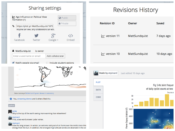
Emailing code, data, graphs, files, and folders around is painful (see below). Discussing all these different objects and translating between languages, versions, and file types makes it worse. We’re working on a project called Plotly aimed at solving this problem. The goal is to be a platform for delightful, web-based, language-agnostic plotting and collaboration. In this post, we’ll show how it works for ggplot2 and R.


Email


A first Plotly ggplot2 plot


Let’s make a plot from the ggplot2 cheatsheet. You can copy and paste this code or sign-up for Plotly and get your own key. It’s free, you own your data, and you control your privacy (the set up is quite like GitHub).


install.packages("devtools") # so we can install from github
library("devtools")
install_github("ropensci/plotly") # plotly is part of the ropensci project
library(plotly)
py <- plotly("RgraphingAPI", "ektgzomjbx")  # initiate plotly graph object

library(ggplot2)
library(gridExtra)
set.seed(10005)
 
xvar <- c(rnorm(1500, mean = -1), rnorm(1500, mean = 1.5))
yvar <- c(rnorm(1500, mean = 1), rnorm(1500, mean = 1.5))
zvar <- as.factor(c(rep(1, 1500), rep(2, 1500)))
xy <- data.frame(xvar, yvar, zvar)
plot<-ggplot(xy, aes(xvar)) + geom_histogram()
py$ggplotly()  # add this to your ggplot2 script to call plotly


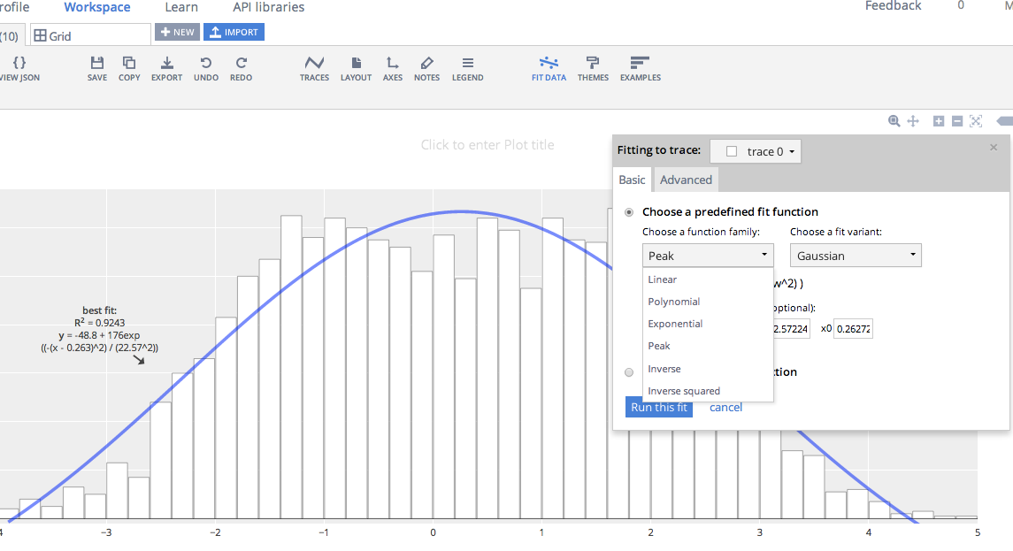
By adding the final line of code, I get the same plot drawn in the browser. It's here: https://plot.ly/~MattSundquist/1899, and also shown in an iframe below. If you re-make this plot, you'll see that we've styled it in Plotly's GUI. Beyond editing, sharing, and exporting, we can also add a fit. The plot is interactive and drawn with D3.js, a popular JavaScript visualization library. You can zoom by clicking and dragging, pan, and see text on the hover by mousing over the plot.


Here is how we added a fit and can edit the figure:


Fits


Your Rosetta Stone for translating figures

When you share a plot or add collaborators, you're sharing an object that contains your data, plot, comments, revisions, and the code to re-make the plot from a few languages. The plot is also added to your profile. I like Wired writer Rhett Allain's profile: https://plot.ly/~RhettAllain.
Collaboration
You can export the figure from the GUI, via an API call, or with a URL. You can also access and share the script to make the exact same plot in different languages, and embed the plot in an iframe, Notebook (see this plot in an IPython Notebook), or webpage like we've done for the above plot.
  • https://plot.ly/~MattSundquist/1899.svg
  • https://plot.ly/~MattSundquist/1899.png
  • https://plot.ly/~MattSundquist/1899.pdf
  • https://plot.ly/~MattSundquist/1899.py
  • https://plot.ly/~MattSundquist/1899.r
  • https://plot.ly/~MattSundquist/1899.m
  • https://plot.ly/~MattSundquist/1899.jl
  • https://plot.ly/~MattSundquist/1899.json
  • https://plot.ly/~MattSundquist/1899.embed
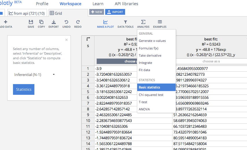
To add or edit data in the figure, we can upload or copy and paste data in the GUI, or append data using R.
Stats
Or call the figure in R:
py <- plotly("ggplot2examples", "3gazttckd7") 
figure <- py$get_figure("MattSundquist", 1339)
str(figure)
And call the data:
figure$data[]

That routine is possible from other languages and any plots. You can share figures and data between a GUI, Python, R, MATLAB, Julia, Excel, Dropbox, Google Drive, and SAS files.

Three Final thoughts

  • Why did we build wrappers? Well, we originally set out to build our own syntax. You can use our syntax, which gives you access to the entirety of Plotly's graphing library. However, we quickly heard from folks that it would be more convenient to be able to translate their figures to the web from libraries they were already using.
  • Thus, Plotly has APIs for R, Julia, Python, MATLAB, and Node.js; supports LaTeX; and has figure converters for sharing plots from ggplot2, matplotlib, and Igor Pro. You can also translate figures from Seaborn, prettyplotlib, and ggplot for Python, as shown in this IPython Notebook. Then if you'd like to you can use our native syntax or the GUI to edit or make 3D graphs and streaming graphs.
  • We've tried to keep the graphing library flexible. So while Plotly doesn't natively support network visualizations (see what we support below), you can make them with MATLAB and Julia, as Benjamin Lind recently demonstrated on this blog. The same is true with maps. If you hit a wall, have feedback, or have questions, let us know. We're at feedback at plot dot ly and @plotlygraphs.
Charts

This is a guest post by Randy Zwitch (@randyzwitch), a digital analytics and predictive modeling consultant in the Greater Philadelphia area. Randy blogs regularly about Data Science and related technologies at http://randyzwitch.com. He’s blogged at Bad Hessian before here.

WordPress Stats - Visitors vs. Views
WordPress Stats – Visitors vs. Views

For those of you with WordPress blogs and have the Jetpack Stats module installed, you’re intimately familiar with this chart. There’s nothing particularly special about this chart, other than you usually don’t see bar charts with the bars shown superimposed.

I wanted to see what it would take to replicate this chart in R, Python and Julia. Here’s what I found. (download the data).

Continue reading

This is a guest post by Monica Lee and Dan Silver. Monica is a Doctoral Candidate in Sociology and Harper Dissertation Fellow at the University of Chicago. Dan is an Assistant Professor of Sociology at the University of Toronto. He received his PhD from the Committee on Social Thought at the University of Chicago.

For the past few months, we’ve been doing some research on musical genres and musical unconventionality.  We’re presenting it at a conference soon and hope to get some initial feedback on the work.

This project is inspired by the Boss, rock legend Bruce Springsteen.  During his keynote speech at the 2012 South-by-Southwest Music Festival in Austin, TX, Springsteen reflected on the potentially changing role of genre classifications for musicians.  In Springsteen’s youth, “there wasn’t much music to play.  When I picked up the best beginner guitar, there was only ten years of Rock history to draw on.”  Now, “no one really hardly agrees on anything in pop anymore.”  That American popular music lacks a center is evident in a massive proliferation in genre classifications:

“There are so many sub–genres and fashions, two–tone, acid rock, alternative dance, alternative metal, alternative rock, art punk, art rock, avant garde metal, black metal, Christian metal, heavy metal, funk metal, bland metal, medieval metal, indie metal, melodic death metal, melodic black metal, metal core…psychedelic rock, punk rock, hip hop, rap, rock, rap metal, Nintendo core [he goes on for quite a while]… Just add neo– and post– to everything I said, and mention them all again. Yeah, and rock & roll.”

Continue reading

As ASA gets closer, so does the first ASA Datathon!

We’re on from 1pm August 15 through 1pm the 16th at Berkeley’s D-Lab. Public presentations and judging will take place at one of the ASA conference hotels, the Hilton Union Square, Room 3-4, Fourth Floor from 6:30-8:15 on August 16th.

We’ve got a new website up — asa-datathon.github.io — that’ll be updated as the event approaches. If you haven’t signed up yet, make sure you do!

Signing up will give us a better idea of who will be at the event and how many folks we can expect to feed and caffinate. We’re also going to give teams a week to get to know each other before the event, so signing up will allow us to make sure everyone gets the same amount of time to work.

If you’re interested, you are invited. We don’t discriminate against particular methodologies or backgrounds. We hope to have social scientists, data scientists, computer scientists, municipal staffers, start-up employees, grad students, and data hackers of all stripes – quantitative, qualitative, and the methodologically agnostic.

Continue reading

Sadly, we haven’t posted in a while. My own excuse is that I’ve been working a lot on a dissertation chapter. I’m presenting this work at the Young Scholars in Social Movements conference at Notre Dame at the beginning of May and have just finished a rather rough draft of that chapter. The abstract:

Scholars and policy makers recognize the need for better and timelier data about contentious collective action, both the peaceful protests that are understood as part of democracy and the violent events that are threats to it. News media provide the only consistent source of information available outside government intelligence agencies and are thus the focus of all scholarly efforts to improve collective action data. Human coding of news sources is time-consuming and thus can never be timely and is necessarily limited to a small number of sources, a small time interval, or a limited set of protest “issues” as captured by particular keywords. There have been a number of attempts to address this need through machine coding of electronic versions of news media, but approaches so far remain less than optimal. The goal of this paper is to outline the steps needed build, test and validate an open-source system for coding protest events from any electronically available news source using advances from natural language processing and machine learning. Such a system should have the effect of increasing the speed and reducing the labor costs associated with identifying and coding collective actions in news sources, thus increasing the timeliness of protest data and reducing biases due to excessive reliance on too few news sources. The system will also be open, available for replication, and extendable by future social movement researchers, and social and computational scientists.

You can find the chapter at SSRN.

This is very much a work still in progress. There are some tasks which I know immediately need to be done — improving evaluation for the closed-ended coding task, incorporating the open-ended coding, and clarifying the methods. From those of you that do event data work, I would love your feedback. Also if you can think of a witty, Googleable name for the system, I’d love to hear that too.

For my dissertation, I’ve been working on a way to generate new protest event data using principles from natural language processing and machine learning. In the process, I’ve been assessing other datasets to see how well they have captured protest events.

I’ve mused on before on assessing GDELT (currently under reorganized management) for protest events. One of the steps of doing this has been to compare it to the Dynamics of Collective Action dataset. The Dynamics of Collective Action dataset (here thereafter DoCA) is a remarkable undertaking, supervised by some leading names in social movements (Soule, McCarthy, Olzak, and McAdam), wherein their team handcoded 35 years of the New York Times for protest events. Each event record includes not only when and where the event took place (what GDELT includes), but over 90 other variables, including a qualitative description of the event, claims of the protesters, their target, the form of protest, and the groups initiating it.

Pam Oliver, Chaeyoon Lim, and I compared the two datasets by looking at a simple monthly time series of event counts and also did a qualitative comparison of a specific month.

Continue reading

Michael Corey asked me to post this CfP for a conference “Demography in the Digital Age,” occurring at Facebook the day before ASA (August 15). Note that this is the same day as the ASA Datathon, but if you’re a demographer this looks very cool.

On August 15th 2014, Facebook is sponsoring a conference on data collection in the digital age. Planned for the day before the American Sociological Association meetings in SF, the conference aims to bring together faculty, grad students, and industry professionals to share techniques related to data collection with the advent of social media and increased interconnectivity across the world.

Continue reading

I’m excited to say that Sociological Science, the new general audience open-access sociology journal, has published its first batch of articles. These include a great set of pieces, including one from my collaborator Chaeyoon Lim on network effects and emotional well-being. But the article “The Structure of Online Activism” by Lewis, Gray, and Meierhenrich caught my eye, for obvious reasons.

I’ve got some thoughts on this article, and following the philosophy of Sociological Science of encouraging “ex post corrections/comments over ex ante R&R demands,” here’s my response, which I’m also posting as a formal response on the Sociological Science site.

Continue reading