The ASA annual meeting starts on Friday, and the program is about 200 pages long. But don’t worry, we’ve got you covered. Here’s a few computational sociology events that you should catch, suggested by folks on the computational sociology listserv.

If you know of any more that look interesting, feel free to post them in the comments and I’ll add them to this Google Calendar.

Seeing Shamus Khan and Phil Kasinitz’s ASA eating guide, I asked a colleague and friend of mine, Grace Nguyen, (a former chef and sometimes New Yorker) to put together a list of good, cheap(er) food options for NYC in preparation for this year’s ASA.
Here’s her compilation. A few more suggestions from her may be forthcoming in the comments. The places are linked to their Yelp pages.
You should also hit up some of these places after the Bad Hessian party, since you’ll be in the Village anyhow.

There have been repeated calls for “space” in many fields of social science (all links are behind paywalls, sorry):

  • Demography: (Voss 2007)
  • Sociology: (Gieryn 2000)
  • Epidemiology: for an early critical review (Jacquez 2000)
  • Geography: obviously geographers were into space before it was cool. A couple of pieces I like are Doreen Massey’s book, For Space and O’Sullivan (2006) for a review of GIS.
  • Anthropology: the proceedings of a conference including a piece by Clifford Geertz, Senses of Place (1996). Though what I’m writing here has less to do with the space/place debate.

These are nice papers about what the authors think should be new research agendas, bu I think social sciences need to stop calling for space and start “playing” with space. Let me explain…

This idea started when fellow Bad Hessian, Alex Hanna, suggested that I read a paper about spatio-temporal models of crime in Chicago. We are in the same writing group. Alex has suffered through many presentations of a paper I’m writing about crime in Chicago. Chicago? Crime? I mean these have to be related papers, right? So I gave it a quick read:

Seth R. Flaxman, Daniel B. Neill, Alex J. Smola. 2013. Correlates of homicide: New space/time interaction tests for spatiotemporal point processes. Heinz College working paper, available at: http://www.heinz.cmu.edu/faculty-and-research/research/research-details/index.aspx?rid=483

…and it’s a really great paper! Flaxman reviews three standard measures for spatial and temporal independence and then proposes a new measure that can simultaneously test for spatio-temporal dependence. The measures are validated against real crime data from Chicago. On the other hand, it’s also completely useless for my project. I mean, I stuck it in a footnote, but I can’t engage with it in a substantively meaningful way because my paper is about the Modifiable Areal Unit Problem and the good ol’ MAUP is fundamentally about polygons — not points. The MAUP occurs because a given set of points can be aggregated into any number of different polygon units, and the subsequent results of models, bivariate relationships, or even hot spot analysis might change based on the aggregation method.

This means that Flaxman’s approach and my approach are not comparable because they each rest on different assumptions about how to measure distance, social interaction, and spatial dependence. They’re based on different spatial ontologies, if you will. But back to the main argument of this post: could we play around with the models in Flaxman, the models I’m making, plus some other models in order to test some of the implications of our ideas of space? Here are some hypothetical hypotheses….

Isotropy. Isotropy means that effects are the same in every direction. For example, weather models often take into account anisotropy because of prevailing wind direction. As Flaxman mentions at the end of the paper, alternative distance measures like Manahatten distance could be used. I would take it a step further and suggest that distance could be measured across a trend surface which might control for higher crime rates on the south side of Chicago and in the near-west suburbs. Likewise, spatial regression models of polygon data can use polynomial terms to approximate trend surfaces. Do the additional controls for anisotropy improve model fit? Or change parameter estimates?

Spatial discontinuities. A neighborhood model posits — albeit implicitly and sort of wishy-washy — that there could be two locations that are very close as the crow flies, but are subject to dramatically different forces because they are in different polygons. These sharp breaks might really exist, e.g. “the bad side of the tracks”, red-lining, TIFF funding, empowerment zones, rivers, gated suburbs. Or they might not. Point process models usually assume that space is continuous, i.e. that there are no discontinuities. Playing around with alternative models might give us evidence one way or another.

Effect decay. In spatial regression models like I’m using, it’s pretty normal to operationalize spatial effects for contiguous polygons and then set the effect to zero for all higher order neighbors. As in the Flaxman paper, most point models use some sort of kernal function to create effect estimates between points within a given bandwidth. These are both pretty arbitrary choices that make spatial effects too “circular”. For exmple, think of the economic geographies of interstate exchanges in middle America. You’ll see fast food, big box retail, gas stations, car dealerships, hotesls, etc. at alomst every interchange. Certainly there is a spatial pattern here but it’s not circular and it’s not (exponentially, geometrically, or linearly) decaying across distance. Comparisons between our standard models — where decay is constrained to follow parametric forms — and semi-parametric “hot spot” analyses might tell us if our models of spatial effects are too far away from reality.

Ok. Those sound like valid research questions, so why not just do that research and publish some results? As I see it, spatial work in social sciences usually boils down to two main types of writing. First, there are the papers that aren’t terribly interested in the substantive research areas, and are more about developing statistical models or testing a bunch of different models with the same data. Here are some examples of that type:

  • (Dormann et al 2007) undertake a herculean task by explicating and producing R code for no less than 13 different spatial models.
  • (Hubbard et al 2010) compare GEE to mixed models of neighborhood health outcomes.
  • (Tita and Greenbaum 2009) compare a spatial versus a spatio-social network as weighting matrices in spatial regression.

The problem with this approach is that the data is often old, simplified data from well-known example datasets. Or worst yet, it is simulated data with none of the usual problems of missing data, measurement error, and outliers. At best, these papers use over simplified models. For example, there aren’t any control variables for crime even when there is a giant body of literature about the socio-cultural correlates of spatial crime patterns (Flaxman and I are both guilty of this).

The second type of research would be just the opposite: interested in the substantive conclusions and disinterested in the vagaries of spatial models. They might compare hierchical or logistic regressions to the spatial regressions, but very rarely go in depth about all the possible ways of operationalizing the spatial processes they’re studying. And when you think about it, you can’t blame them because journal editors like to see logical arguments for the model assumptions used in a paper – not an admission that we don’t know anything about the process under study and a bunch of different models all with slightly different operationalizations of the spatial process. But here’s the thing: we don’t actually know very much about the spatial processes at work! And we have absolutely no evidence that the spatial processes for, say, crime are also useful in other domains like educational outcomes, voting behavior, factory siting, human pathogens, or communication networks.

Thus, we don’t need more social science papers that do spatial models. We need (many) more social science papers that do multiple, incongruent spatial models on the same substantively rich datasets. I think it’s only by modeling, for example, crime as an isotropic point process, a social network with spatial distance between nodes, and a series of discrete neighborhood polygons can we start to grasp if one set of assumptions about space is more/less accurate and more/less useful. In case you couldn’t tell, I’m a big fan of George Box’s famous quote. This is the slightly longer version:

“Remember that all models are wrong; the practical question is how wrong do they have to be to not be useful.” (Box & Draper 1987, 74)

Good luck, and go play!

[Update, 2013-07-22: I changed the citation to the Flaxman paper, as it is now a working paper in his department at Carneige Mellon University.]


R users know it can be finicky in its requirements and opaque in its error messages. The beginning R user often then happily discovers that a mailing list for dealing with R problems with a large and active user base, R-help, has existed since 1997. Then, the beginning R user wades into the waters, asks a question, and is promptly torn to shreds for inadequate knowledge of statistics and/or the software, for wanting to do something silly, or for the gravest sin of violating the posting guidelines. The R user slinks away, tail between legs, and attempts to find another source of help. Or so the conventional wisdom goes. Late last year, someone on Twitter (I don’t remember who, let me know if it was you) asked if R-help was getting meaner. I decided to collect some evidence and find out.

Our findings are surprising, but I think I have some simple sociological explanations.
Continue reading

Does anyone know a statistical test for telling me if I have an outlier within a set of spatial point data? It seems like someone should have invented said method in the 1960s and I just can’t find it through my googling. But I do read a fair bit of GIS and geostatistics literature, and I’ve never seen it. (Or, gasp, someone tried to do it and concluded it was intractable…) Guess I’ll have to make my own.

So here’s my situation: I have some point data – just normal latitude and longitude coordinates – with an associated covariate. Let’s call the covariate m for now. I want to draw a polygon around my points and argue that the resulting shape can be defined as the boundary of a neighborhood. Except I’m worried that there are really high, or really low, values of m near the border of the neighborhood, and thus my resulting polygons are potentially skewed toward/away from these “spatial outliers.”

As an illustration, imagine that a potato farmer wants to spray her field for aphids, but only wants to spray the affected areas. Logically, she decides to randomly sample 10 locations within her field; draw a polygon around the locations where she finds aphids; and then spray all the area inside the polygon (and none of the area outside the polygon). You could check out UC-Davis’s excellent website for potato pest management to confirm that this is not exactly the correct method, but it’s a reasonable approximation (although, their recommendation on sampling is radically different).

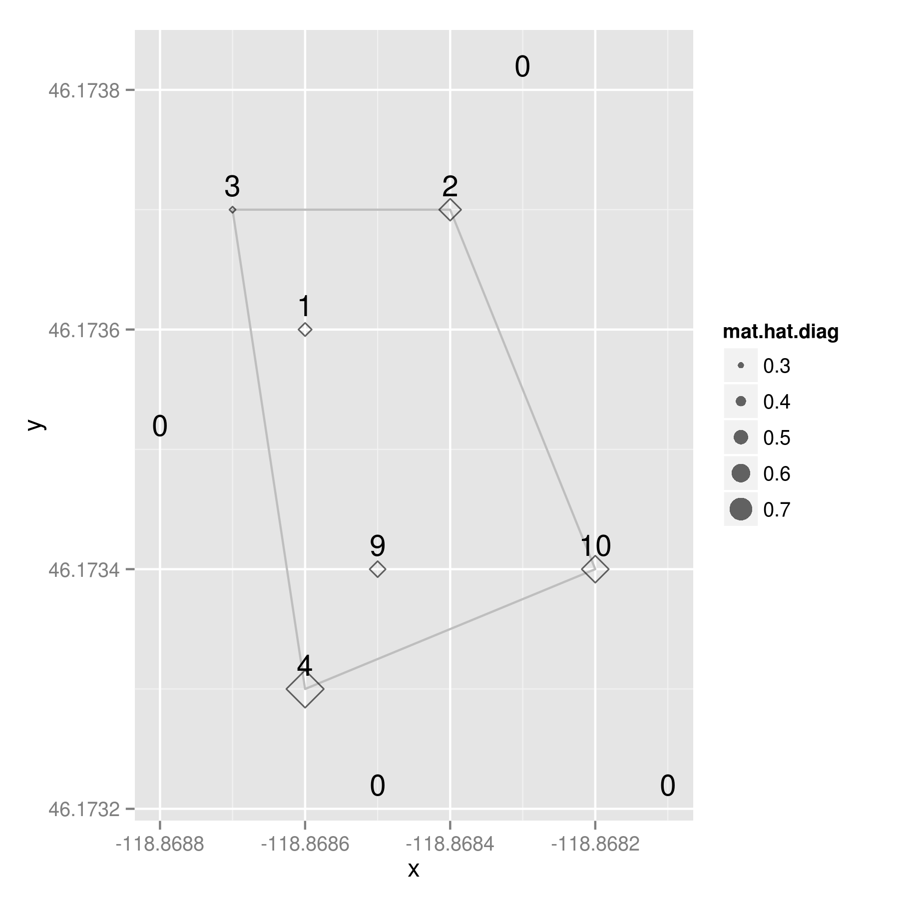
Our potato farmer might observe something like this. The labels are the aphid counts at each location. I’ll explain the diamond symbols in a moment….

potatoes

Remember that the “polygon of infestation” is drawn according to a presence/absence dichotomy, so the aphid count is the covariate in this situation. (And, yes, it has already occurred to me that everything I’m writing here might only apply to this special case where the polygon is based on a dichotomized version of an underlying count variable, m. But that additional complication is for future blogage….)

Here’s the data for those that want to play along at home:
i         x       y  m
1 -118.8682 46.1734 10
2 -118.8687 46.1737 3
3 -118.8683 46.1738 0
4 -118.8685 46.1732 0
5 -118.8688 46.1735 0
6 -118.8681 46.1732 0
7 -118.8686 46.1733 4
8 -118.8685 46.1734 9
9 -118.8684 46.1737 2
10 -118.8686 46.1736 1

I am trying to calculate the amount that any given point might be considered an outlier. Either an outlier in terms of the distribution of the covariate, a spatial outlier, or both. To me, this sounds like a perfect situation to calculate leverages via the hat matrix. You may remember from an intro regression course – or maybe you don’t, because sadly, regression is usually not taught from a matrix algebra point of view – that the hat matrix is a n X n square matrix of observations, which puts a hat on the observed Y variable:

y-hat = H * y

More importantly for my purposes, the diagonal elements of any hat matrix (usually denoted h_ii), indicate the amount of leverage that observation i has on y-hat. And even better for my purposes, I don’t need a Y variable to calculate a hat matrix because it’s composed entirely of the design matrix, and a few transformations there of:

H = X * ( t(X) * X )^{-1} * t(X)

where X is the n X p design matrix of n observations and p independent variables; and t(X) is the transpose of X, and X^{-1} is the usual inverse matrix.

My design matrix, X, has the latitude, longitude, and aphid counts from my potato example. When I calculate a hat matrix for it, the resulting values are indicators of leverage — both spatially and on the covariate. Now look back up there at that map. See those diamond shapes? They’re proportionally sized based on the value of the diagonal of the hat matrix (h_ii) for each observation. And what do we conclude from this little example?

By looking at the raw aphid counts, our potato farmer may have been tempted to enlarge the spraying zone around the points with nine and 10 aphids — they seem like rather high values and they’re both kind of near the edge of the polygon. However, the most “outlierly” observation in her sample was the spot with four aphids located at the southwest corner of the polygon.
It has a hat value of .792488, a good bit larger than the location with 10 aphids, which had a hat value of 0.615336.

At this point, a good geostatistician could probably come up with a measure of significance to go along with my hat values, but I’m not a geostatistician – good or otherwise. I just Monte Carlo-ed the values a bit and concluded…. given this arrangement of sample points *with aphids,* about 11% of the time we would see a hat value equal to or above .792488. If we use the standard alpha level of .05 found in most social science publications, our potato farmer would be forced to accept the null hypothesis that the observed aphid counts were drawn from a random distribution. I.e. there aren’t any outliers – beyond what we would expect from randomness – so she should trust the polygon as a good boundary of the zone of infestation. (Note my emphasis of “with aphids” in the conclusion. I could have Monte Carlo-ed the points with zero counts, but chose not to because, laziness. Not sure if that changes the conclusions…)

So? Two things: 1) I would love to find out that someone else invented a better method for detecting spatial outliers in point pattern data; and 2) hat matrices are really useful.

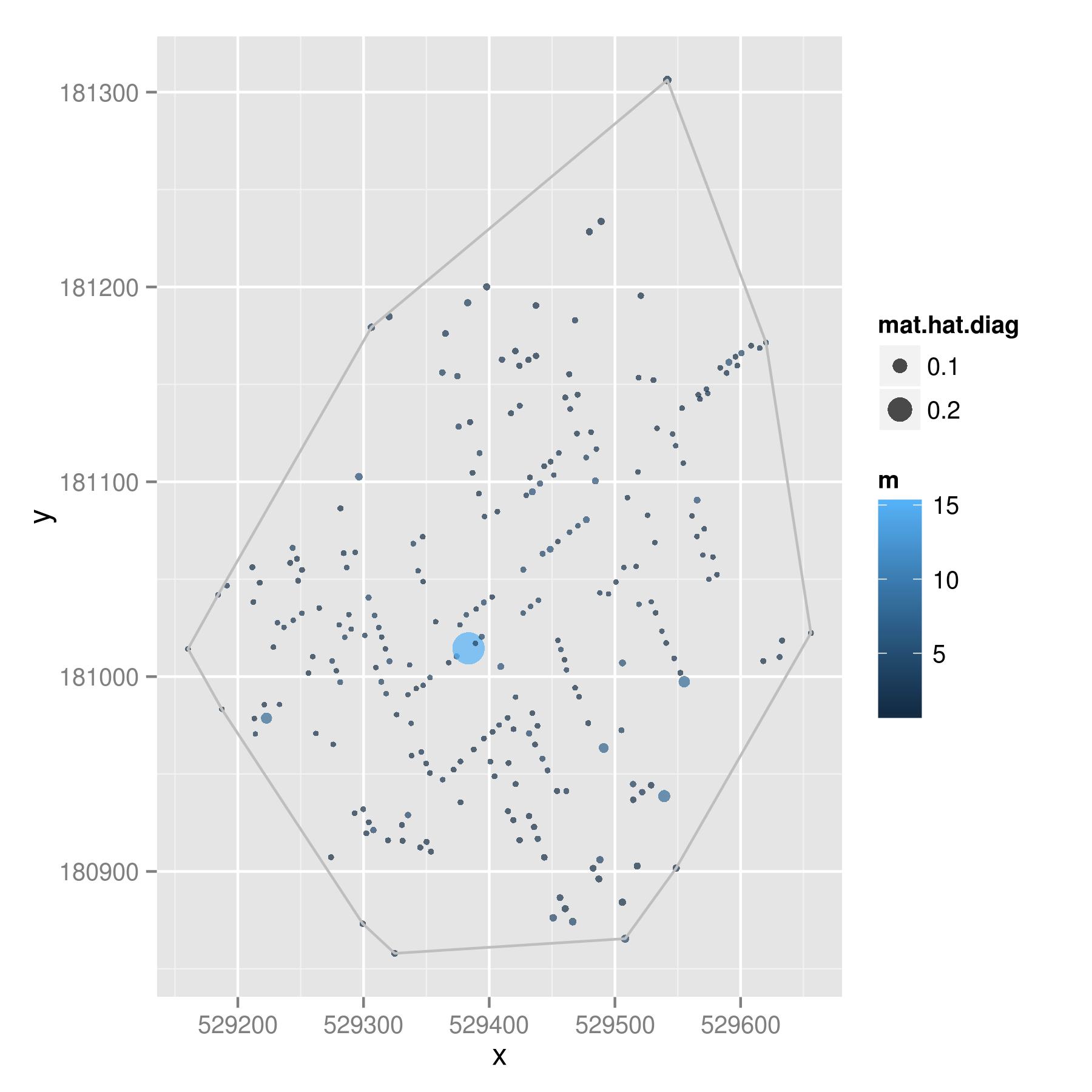
And because one dataset is never enough, I downloaded a version of John Snow’s cholera data that Robin Wilson digitized from the original maps. Same procedure here, except color indicates the number of deaths at each location and the dot circumference indicates the hat values.

cholera

That point in the middle had 15 deaths when most of the addresses had one or two deaths; this created a hat value of .28009. Given 1000 Monte Carlo trials, less than 2% of the draws showed a hat value higher than .28009. So even though this point looks to be quite close to the middle of the points, it is likely to be a spatial outlier – above and beyond what we would expect given randomness.

Comments? Suggestions for improvements? Pictures of John Snow wearing dapper hats?


Neal Caren of UNC Sociology has put out a call to forecast the number of NRA members in June 2013 using NRA publication subscriber data. Given that Neal’s interests elide with those of several Bad Hessian contributors and per my previous post on predictions in sociology, I took a stab using the forecast package for R. You can find the code I used here and my forecast can be found on scatterplot here.

raspberry-pi-top

A friend of mine has recently let me borrow a Raspberry Pi, a tiny, ultra-cheap computer that uses an SD card for a hard drive and uses a mini-USB cord for power. It runs either their Debian distro (Raspbian) or Arch without much trouble.

I’ve been thinking of cool things to do with it. There are a number of pretty cool projects that folks have done with a little bit of wiring and elbow grease. These are no doubt amazing and worthy of much geek admiration. I’ve been trying to think of something novel to do with mine. Matt and I thought we were on to something when we discussed a cat toy that would change direction when it hit a wall.

I put the little DC motor away when I realized that there’s probably some nifty social scientific data that can be had by a tiny computing device with a portable power source and USB wireless card. Asking Twitter about what one could do here, David Masad suggested replicating this study which estimates crowds using dropped wireless packets. A few other ideas I’ve had suggest that using an infrared sensor could count foot traffic in particular areas, sensors hooked up next to a door to get data on entering and leaving a room, or a sound monitor that collects data on voice interaction. Of course, some of these suggestions get dangerously close to violating individual privacy and disclosure, so the more that these sensors make people anonymous the better.

So, tossing this idea out to Bad Hessian readers — what would be some other “unobtrusive methods” that could be leveraged with a tiny computer and some simple sensors?