About Alex

Alex Hanna is a PhD candidate in sociology at the University of Wisconsin-Madison. Substantively, I'm interested in social movements, media, and the Middle East. Methodologically, I'm interested in computational social science, textual analysis, and social network analysis. You can find me on Twitter at @alexhanna and on the web at http://alex-hanna.com.

Pablo Barberá, Dan Cervone, and I prepared a short course at New York University on Data Science and Social Science, sponsored by several institutes at NYU. The course was intended as an introduction to R and basic data science tasks, including data visualization, social network analysis, textual analysis, web scraping, and APIs. The workshop is geared towards social scientists with little experience in R, but experience with other statistical packages.

You can download and tinker around with the materials on GitHub.

Posted in R.

If you’re looking for a good outlet for some computationally-oriented social science work, check out the International Conference on Computational Social Science (IC^2S^2). (Disclaimer: I am on the program committee for this conference). Last year, as the Computational Social Science Summit, the conference attracted 200 participants and had a very vibrant set of panels.

Abstracts are due on January 31, 2016. Hoping to see many of you there!

A few weeks ago I helped organize and instruct a Software Carpentry workshop geared towards social scientists, with the great help from folks at UW-Madison’s Advanced Computing Institute. Aside from tweaking a few examples (e.g. replacing an example using fake cochlear implant data with one of fake survey data), the curriculum was largely the same. The Software Carpentry curriculum is made to help researchers, mostly in STEM fields, to write code for reproducibility and collaboration. There’s instruction in the Unix shell, a scripting language of your choice (we did Python), and collaboration with Git.

We had a good mix of folks at the workshop, many who had some familiarity with coding to those who had zero experience. There were a number of questions at the workshop about how folks could use these tools in their research, a lot of them coming from qualitative researchers.

I was curious about what other ways researchers who use qualitative methods could incorporate programming into their research routine. So I took to Facebook and Twitter.

Continue reading

[Note: I do realize that this event was nearly two months ago. I have no one to blame but the academic job market.]

On August 15 and 16, we held the first annual ASA Datathon at the D-Lab at Berkeley. Nearly 25 people came from academia, industry, and government participated during the 24-hour hack session. The datathon focused on open city data and methods, and questions surrounded issues such as gentrification, transit, and urban change.

Two of our sponsors kicked off the event by giving some useful presentations on open city data and visualization tools. Mike Rosengarten from OpenGov presented on OpenGov’s incredibly detailed and descriptive tools for exploring municipal revenues and budgets. And Matt Sundquist from plot.ly showed off the platform’s interactive interface which works across multiple programming environments.

Fueled by various elements of caffeine and great food, six teams hacked away through the night and presented their work on the 16th at the Hilton San Francisco. Our excellent panel of judges picked the three top presentations which stood out the most:

Honorable mention: Spurious Correlations

The Spurious Correlations team developed a statistical definition for gentrification and attempted to define which zip codes had been gentrified by their definition. Curious about those doing the gentrifying, they asked if artists acted as “middle gentrifiers.” While this seemed to correlate in Minneapolis, it didn’t hold for San Francisco.

Second place: Team Vélo 

Team Vélo, as the name implies, was interested in bike thefts in San Francisco and crime in general. They used SFPD data to rate crime risk in each neighborhood and tried to understand which factors may be influencing crime rates, including racial diversity, income, and self-employment.

First place: Best Buddies Bus Brigade

Lastly, our first place winners asked “Does SF public transportation underserve those in low-income communities or without cars?” Using San Francisco transit data, they developed a visualization tool to investigate bus load and how this changes by location, conditional on things like car ownership.

You can check out all the presentations at the datathon’s GitHub page.

Laura Nelson, Laura Norén, and I want to give a special thanks to our sponsors: OpenGov, UC Berkeley Sociology, UW Madison Sociology, the D-Lab, SurveyGizmo, the Data Science Toolkit, Duke Network Analysis Center, plot.ly, orgtheory, Fabio Rojas, Neal Caren, and Pam Oliver.

The past two years we’ve had our own Bad Hessian shindig, to much win and excitement. This year we’re going to leech off other events and call them our own.

The first will be the after party to the ASA Datathon. We don’t actually have a place for this yet, but judging will take place on Saturday, August 16, 6:30-8:30 PM in the Hilton Union Square, Fourth Floor, Rooms 3-4. So block out 8:30-onwards for Bad Hessian party times.

The second place you can catch us is with the rest of the sociology blog crowd at Trocadero Club, Sunday, August 17, at 5:30 PM.

If you haven’t had enough, you can probably catch many of us at ASA Karaoke 2014: Computational Karaoke in the Age of Big Data. Bonus points for singing the most “big data” of songs.

As ASA gets closer, so does the first ASA Datathon!

We’re on from 1pm August 15 through 1pm the 16th at Berkeley’s D-Lab. Public presentations and judging will take place at one of the ASA conference hotels, the Hilton Union Square, Room 3-4, Fourth Floor from 6:30-8:15 on August 16th.

We’ve got a new website up — asa-datathon.github.io — that’ll be updated as the event approaches. If you haven’t signed up yet, make sure you do!

Signing up will give us a better idea of who will be at the event and how many folks we can expect to feed and caffinate. We’re also going to give teams a week to get to know each other before the event, so signing up will allow us to make sure everyone gets the same amount of time to work.

If you’re interested, you are invited. We don’t discriminate against particular methodologies or backgrounds. We hope to have social scientists, data scientists, computer scientists, municipal staffers, start-up employees, grad students, and data hackers of all stripes – quantitative, qualitative, and the methodologically agnostic.

Continue reading

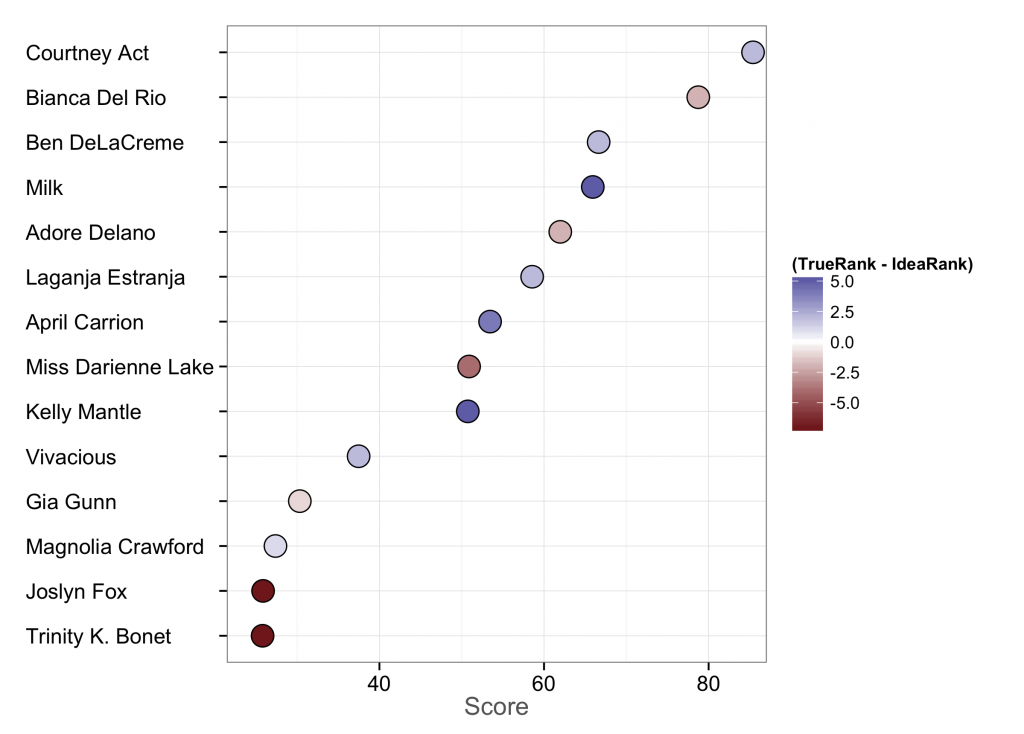
With Season 6 of RuPaul’s Drag Race in the books and the new queen crowned, it’s time to reflect on how our pre-season forecasts did. In February I posted a wiki survey asking who would win this season before the first episode had aired. I posted this to reddit’s r/rupaulsdragrace, Twitter, and Facebook, and it generated an impressive 15,632 votes for 435 unique user sessions. Which means the average survey taker did a little under 36 pairwise comparisons.

The plot below shows the results. The x-axis is the score assigned by the All Our Ideas statistical model and can be interpreted that, if “idea” 1 (or, in this case, queen 1) is pitted at random against idea 2, this is the chance that idea 1 will win. The color is how close the wiki survey got to the actual rank. The more pale the dot, the closer. Bluer dots mean the wiki survey overestimated the queen, while redder dots mean it underestimated them.

s6-plot

So how did the wiki survey do? Not terrible. Courtney Act was a clear frontrunner and had a lot of star power to carry her to the end. Bianca was a close second in the wiki survey and finally outshone her when it came to the final. These two are relatively close to each other in score. This was actually the first season in which two queens never had to lipsync. Ben DeLaCreme is ranked third in the survey, although she came in fifth. Little surprise she was voted Miss Congeniality.

After that, it gets interesting. Milk was ranked four by the survey, but came in 9th on the show. I’m thinking her quirkiness may have given folks the impression that she could go much further than she actually did. Adore, one of the top three, comes in fifth on the survey, rather close to her friend Laganja.

April Carrion and Kelly Mantle were expected to go far, but got the chop relatively early on. Darienne was a dark horse in this competition, ending up in fourth place when pre-season fans thought she’d be middling.

Lastly, Joslyn and Trinity are the biggest success stories of season 6. They had a surprising amount of staying power when folks thought they wouldn’t make it out of the first month.

So what can we learn from this? Well, for one, for a more or less staged reality show, I’m somewhat impressed by how well these rankings came out. Unlike using wiki surveys for sports forecasting, we have no prior information on contestants from season to season. Prior seasons give us no information about contestants (unless you consider something like “drag lineages”, e.g. Laganja is Alyssa Edwards’s drag daughter). All information comes from the domain expertise of drag aficionados. Courtney and Bianca were already widely regarded drag stars in their own right before the competition. Although this didn’t seem to be the case with other seasons, it seems like there was a strong Matthew effect at work this time. Is this the new normal as more well-known queens start competing?


Sadly, we haven’t posted in a while. My own excuse is that I’ve been working a lot on a dissertation chapter. I’m presenting this work at the Young Scholars in Social Movements conference at Notre Dame at the beginning of May and have just finished a rather rough draft of that chapter. The abstract:

Scholars and policy makers recognize the need for better and timelier data about contentious collective action, both the peaceful protests that are understood as part of democracy and the violent events that are threats to it. News media provide the only consistent source of information available outside government intelligence agencies and are thus the focus of all scholarly efforts to improve collective action data. Human coding of news sources is time-consuming and thus can never be timely and is necessarily limited to a small number of sources, a small time interval, or a limited set of protest “issues” as captured by particular keywords. There have been a number of attempts to address this need through machine coding of electronic versions of news media, but approaches so far remain less than optimal. The goal of this paper is to outline the steps needed build, test and validate an open-source system for coding protest events from any electronically available news source using advances from natural language processing and machine learning. Such a system should have the effect of increasing the speed and reducing the labor costs associated with identifying and coding collective actions in news sources, thus increasing the timeliness of protest data and reducing biases due to excessive reliance on too few news sources. The system will also be open, available for replication, and extendable by future social movement researchers, and social and computational scientists.

You can find the chapter at SSRN.

This is very much a work still in progress. There are some tasks which I know immediately need to be done — improving evaluation for the closed-ended coding task, incorporating the open-ended coding, and clarifying the methods. From those of you that do event data work, I would love your feedback. Also if you can think of a witty, Googleable name for the system, I’d love to hear that too.

For my dissertation, I’ve been working on a way to generate new protest event data using principles from natural language processing and machine learning. In the process, I’ve been assessing other datasets to see how well they have captured protest events.

I’ve mused on before on assessing GDELT (currently under reorganized management) for protest events. One of the steps of doing this has been to compare it to the Dynamics of Collective Action dataset. The Dynamics of Collective Action dataset (here thereafter DoCA) is a remarkable undertaking, supervised by some leading names in social movements (Soule, McCarthy, Olzak, and McAdam), wherein their team handcoded 35 years of the New York Times for protest events. Each event record includes not only when and where the event took place (what GDELT includes), but over 90 other variables, including a qualitative description of the event, claims of the protesters, their target, the form of protest, and the groups initiating it.

Pam Oliver, Chaeyoon Lim, and I compared the two datasets by looking at a simple monthly time series of event counts and also did a qualitative comparison of a specific month.

Continue reading

Michael Corey asked me to post this CfP for a conference “Demography in the Digital Age,” occurring at Facebook the day before ASA (August 15). Note that this is the same day as the ASA Datathon, but if you’re a demographer this looks very cool.

On August 15th 2014, Facebook is sponsoring a conference on data collection in the digital age. Planned for the day before the American Sociological Association meetings in SF, the conference aims to bring together faculty, grad students, and industry professionals to share techniques related to data collection with the advent of social media and increased interconnectivity across the world.

Continue reading