
Does anyone know a statistical test for telling me if I have an outlier within a set of spatial point data? It seems like someone should have invented said method in the 1960s and I just can’t find it through my googling. But I do read a fair bit of GIS and geostatistics literature, and I’ve never seen it. (Or, gasp, someone tried to do it and concluded it was intractable…) Guess I’ll have to make my own.
So here’s my situation: I have some point data – just normal latitude and longitude coordinates – with an associated covariate. Let’s call the covariate m for now. I want to draw a polygon around my points and argue that the resulting shape can be defined as the boundary of a neighborhood. Except I’m worried that there are really high, or really low, values of m near the border of the neighborhood, and thus my resulting polygons are potentially skewed toward/away from these “spatial outliers.”
As an illustration, imagine that a potato farmer wants to spray her field for aphids, but only wants to spray the affected areas. Logically, she decides to randomly sample 10 locations within her field; draw a polygon around the locations where she finds aphids; and then spray all the area inside the polygon (and none of the area outside the polygon). You could check out UC-Davis’s excellent website for potato pest management to confirm that this is not exactly the correct method, but it’s a reasonable approximation (although, their recommendation on sampling is radically different).
Our potato farmer might observe something like this. The labels are the aphid counts at each location. I’ll explain the diamond symbols in a moment….
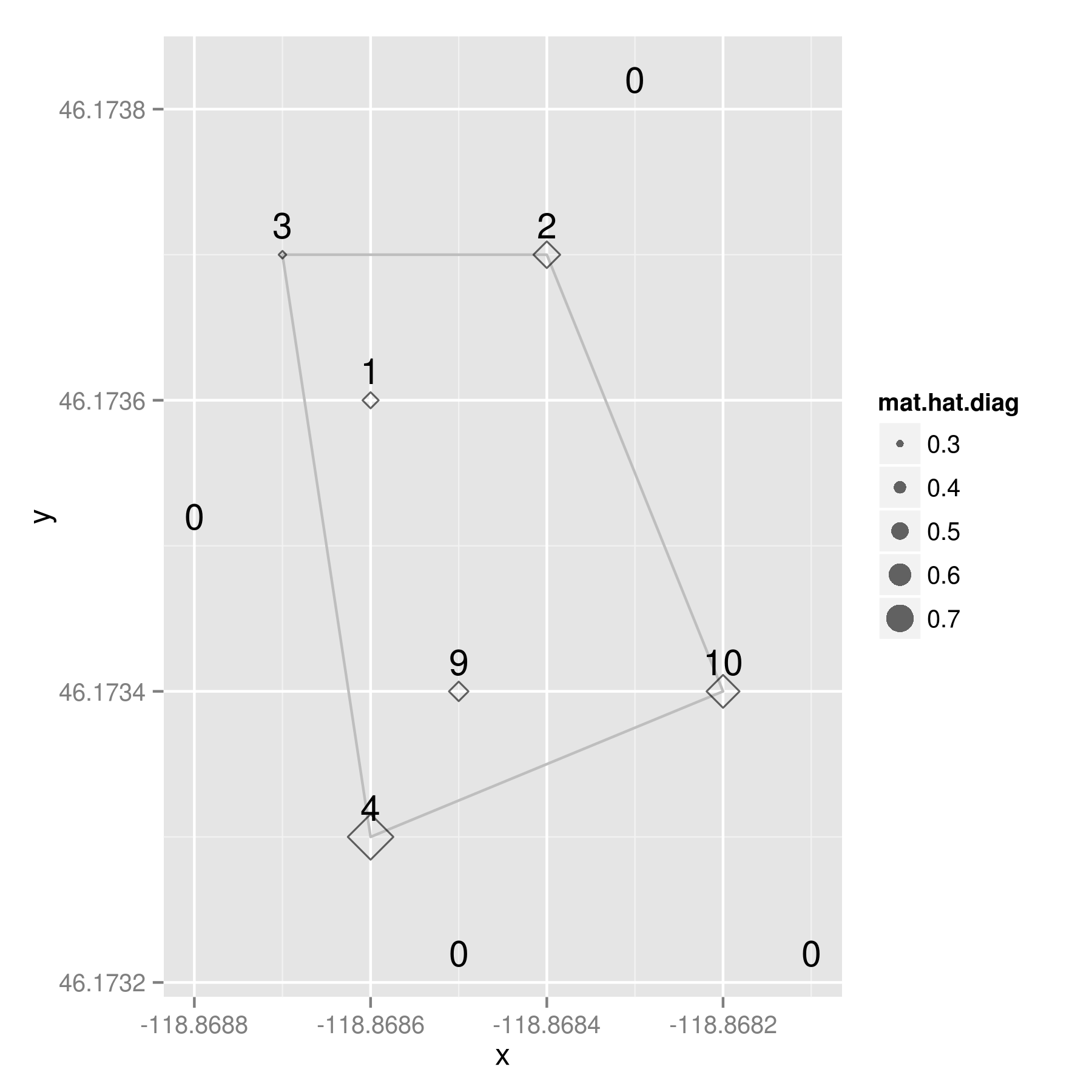
Remember that the “polygon of infestation” is drawn according to a presence/absence dichotomy, so the aphid count is the covariate in this situation. (And, yes, it has already occurred to me that everything I’m writing here might only apply to this special case where the polygon is based on a dichotomized version of an underlying count variable, m. But that additional complication is for future blogage….)
Here’s the data for those that want to play along at home:
i         x       y  m

1 -118.8682 46.1734 10

2 -118.8687 46.1737 3

3 -118.8683 46.1738 0

4 -118.8685 46.1732 0

5 -118.8688 46.1735 0

6 -118.8681 46.1732 0

7 -118.8686 46.1733 4

8 -118.8685 46.1734 9

9 -118.8684 46.1737 2

10 -118.8686 46.1736 1
I am trying to calculate the amount that any given point might be considered an outlier. Either an outlier in terms of the distribution of the covariate, a spatial outlier, or both. To me, this sounds like a perfect situation to calculate leverages via the hat matrix. You may remember from an intro regression course – or maybe you don’t, because sadly, regression is usually not taught from a matrix algebra point of view – that the hat matrix is a n X n square matrix of observations, which puts a hat on the observed Y variable:
y-hat = H * y
More importantly for my purposes, the diagonal elements of any hat matrix (usually denoted h_ii), indicate the amount of leverage that observation i has on y-hat. And even better for my purposes, I don’t need a Y variable to calculate a hat matrix because it’s composed entirely of the design matrix, and a few transformations there of:
H = X * ( t(X) * X )^{-1} * t(X)
where X is the n X p design matrix of n observations and p independent variables; and t(X) is the transpose of X, and X^{-1} is the usual inverse matrix.
My design matrix, X, has the latitude, longitude, and aphid counts from my potato example. When I calculate a hat matrix for it, the resulting values are indicators of leverage — both spatially and on the covariate. Now look back up there at that map. See those diamond shapes? They’re proportionally sized based on the value of the diagonal of the hat matrix (h_ii) for each observation. And what do we conclude from this little example?
By looking at the raw aphid counts, our potato farmer may have been tempted to enlarge the spraying zone around the points with nine and 10 aphids — they seem like rather high values and they’re both kind of near the edge of the polygon. However, the most “outlierly” observation in her sample was the spot with four aphids located at the southwest corner of the polygon.
It has a hat value of .792488, a good bit larger than the location with 10 aphids, which had a hat value of 0.615336.
At this point, a good geostatistician could probably come up with a measure of significance to go along with my hat values, but I’m not a geostatistician – good or otherwise. I just Monte Carlo-ed the values a bit and concluded…. given this arrangement of sample points *with aphids,* about 11% of the time we would see a hat value equal to or above .792488. If we use the standard alpha level of .05 found in most social science publications, our potato farmer would be forced to accept the null hypothesis that the observed aphid counts were drawn from a random distribution. I.e. there aren’t any outliers – beyond what we would expect from randomness – so she should trust the polygon as a good boundary of the zone of infestation. (Note my emphasis of “with aphids” in the conclusion. I could have Monte Carlo-ed the points with zero counts, but chose not to because, laziness. Not sure if that changes the conclusions…)
So? Two things: 1) I would love to find out that someone else invented a better method for detecting spatial outliers in point pattern data; and 2) hat matrices are really useful.
And because one dataset is never enough, I downloaded a version of John Snow’s cholera data that Robin Wilson digitized from the original maps. Same procedure here, except color indicates the number of deaths at each location and the dot circumference indicates the hat values.
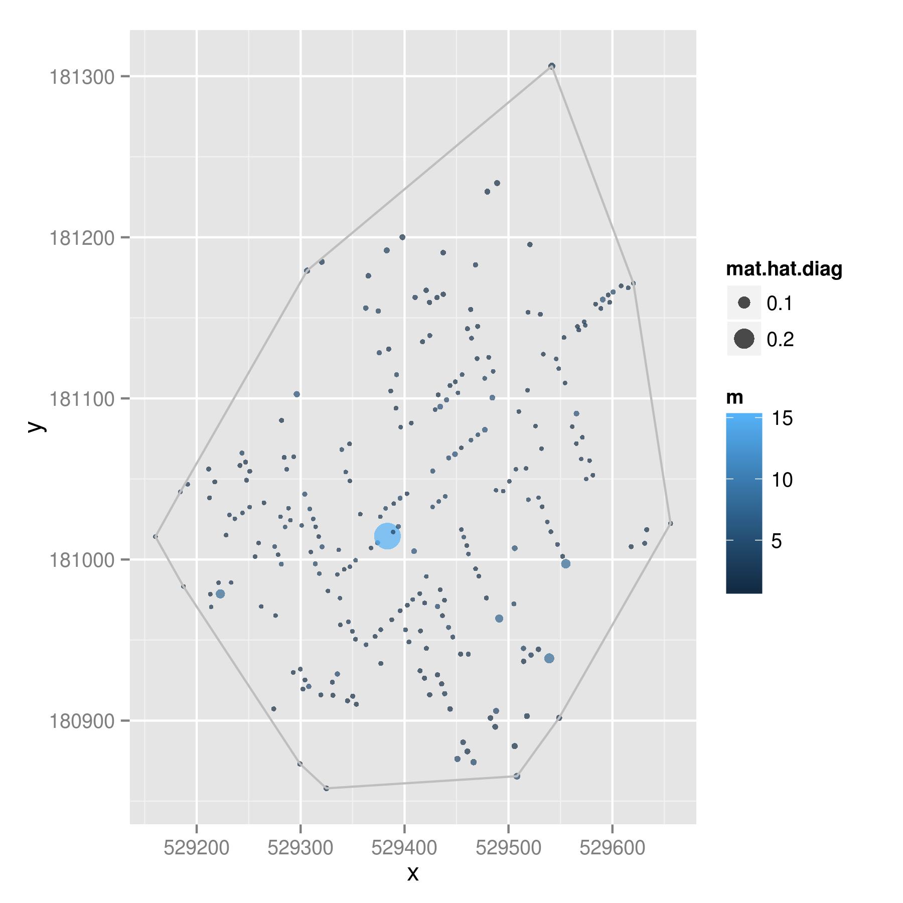
That point in the middle had 15 deaths when most of the addresses had one or two deaths; this created a hat value of .28009. Given 1000 Monte Carlo trials, less than 2% of the draws showed a hat value higher than .28009. So even though this point looks to be quite close to the middle of the points, it is likely to be a spatial outlier – above and beyond what we would expect given randomness.
Comments? Suggestions for improvements? Pictures of John Snow wearing dapper hats?