About Adam

Adam Slez is an Assistant Professor in the Department of Sociology at the University of Virginia. While much of his work is historical, it often involves forays into the world of network analysis, multilevel models, and spatial econometrics.

walker_5.png-large

The graph above recently appeared as part of Scott Walker’s Twitter feed. Presumably, the idea is to suggest that under Walker’s leadership, Wisconsin has done better than the country as a whole when it comes to unemployment, though an alternative version of the ad makes it somewhat more personal, using the same basic figures to suggest that Walker—a Republican presidential candidate—is outperforming sitting Democratic president Barack Obama. In these ads, the Walker campaign repeatedly highlights the fact that the unemployment rate in Wisconsin is lower than the national average. Note, however, that the unemployment rate in Wisconsin was already lower than the national average when Walker took office. In other words, Walker inherited a good labor market. If we want to measure Walker’s effect on the Wisconsin economy, we need to look at changes in the unemployment rate over time.

Continue reading

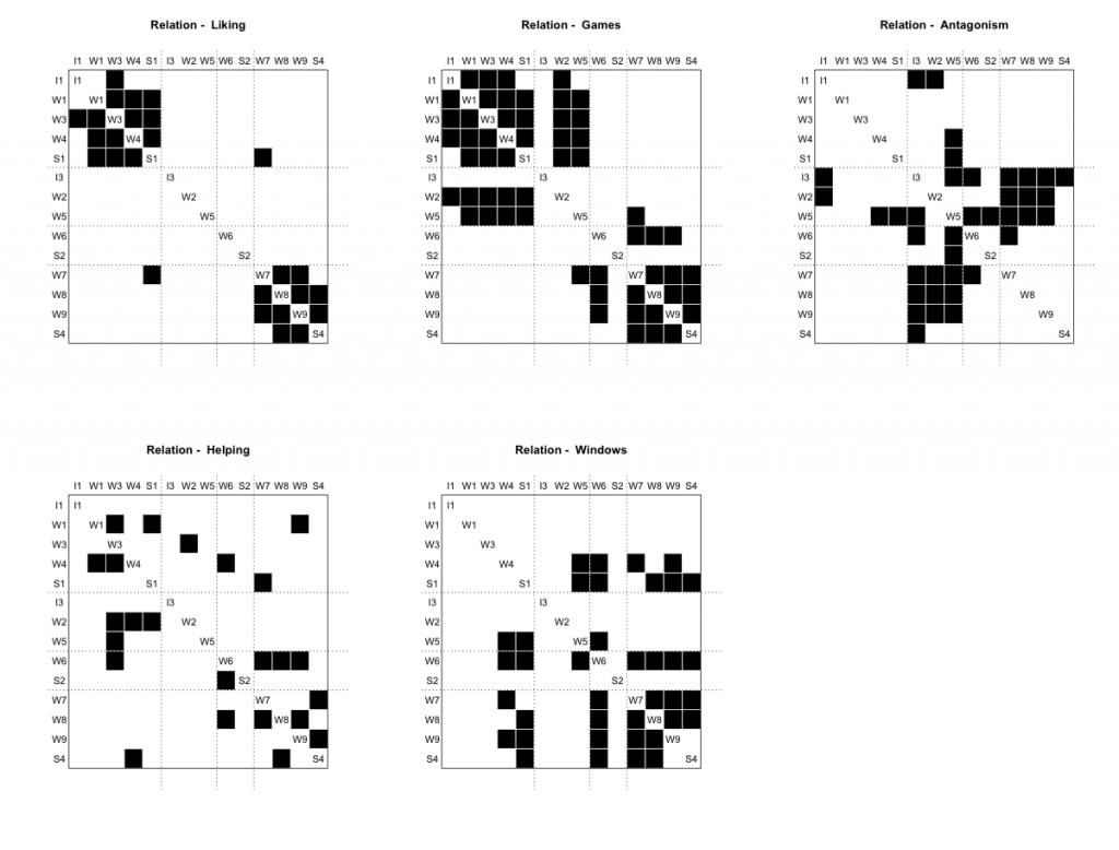
In network analysis, blockmodels provide a simplified representation of a more complex relational structure. The basic idea is to assign each actor to a position and then depict the relationship between positions. In settings where relational dynamics are sufficiently routinized, the relationship between positions neatly summarizes the relationship between sets of actors. How do we go about assigning actors to positions? Early work on this problem focused in particular on the concept of structural equivalence. Formally speaking, a pair of actors is said to be structurally equivalent if they are tied to the same set of alters. Note that by this definition, a pair of actors can be structurally equivalent without being tied to one another. This idea is central to debates over the role of cohesion versus equivalence.

In practice, actors are almost never exactly structural equivalent to one another. To get around this problem, we first measure the degree of structural equivalence between each pair of actors and then use these measures to look for groups of actors who are roughly comparable to one another. Structural equivalence can be measured in a number of different ways, with correlation and Euclidean distance emerging as popular options. Similarly, there are a number of methods for identifying groups of structurally equivalent actors. The equiv.clust routine included in the sna package in R, for example, relies on hierarchical cluster analysis (HCA). While the designation of positions is less cut and dry, one can use multidimensional scaling (MDS) in a similar manner. MDS and HCA can also be used in combination, with the former serving as a form of pre-processing. Either way, once clusters of structurally equivalent actors have been identified, we can construct a reduced graph depicting the relationship between the resulting groups.

Yet the most prominent examples of blockmodeling built not on HCA or MDS, but on an algorithm known as CONCOR. The algorithm takes it name from the simple trick on which it is based, namely the CONvergence of iterated CORrelations. We are all familiar with the idea of using correlation to measure the similarity between columns of a data matrix. As it turns out, you can also use correlation to measure the degree of similarity between the columns of the resulting correlation matrix. In other words, you can use correlation to measure the similarity of similarities. If you repeat this procedure over and over, you eventually end up with a matrix whose entries take on one of two values: 1 or -1. The final matrix can then be permuted to produce blocks of 1s and -1s, with each block representing a group of structurally equivalent actors. Dividing the original data accordingly, each of these groups can be further partitioned to produce a more fine-grained solution.

Insofar as CONCOR uses correlation as a both a measure of structural equivalence as well as a means of identifying groups of structurally equivalent actors, it is easy to forget that blockmodeling with CONCOR entails the same basic steps as blockmodeling with HCA. The logic behind the two procedures is identical. Indeed, Breiger, Boorman, and Arabie (1975) explicitly describe CONCOR as a hierarchical clustering algorithm. Note, however, that when it comes to measuring structural equivalence, CONCOR relies exclusively on the use of correlation, whereas HCA can be made to work with most common measures of (dis)similarity.

Since CONCOR wasn’t available as part of the sna or igraph libraries, I decided to put together my own CONCOR routine. It could probably still use a little work in terms of things like error checking, but there is enough there to replicate the wiring room example included in the piece by Breiger et al. Check it out! The program and sample data are available on my GitHub page. If you have devtools installed, you can download everything directly using R. At the moment, the concor_hca command is only set up to handle one-mode data, though this can be easily fixed. In an earlier version of the code, I included a second function for calculating tie densities, but I think it makes more sense to use concor_hca to generate a membership vector which can then be passed to the blockmodel command included as part of the sna library.

#REPLICATE BREIGER ET AL. (1975)
#INSTALL CONCOR
devtools::install_github("aslez/concoR")

#LIBRARIES
library(concoR)
library(sna)

#LOAD DATA
data(bank_wiring)
bank_wiring

#CHECK INITIAL CORRELATIONS (TABLE III)
m0 <- cor(do.call(rbind, bank_wiring))
round(m0, 2)

#IDENTIFY BLOCKS USING A 4-BLOCK MODEL (TABLE IV)
blks <- concor_hca(bank_wiring, p = 2)
blks

#CHECK FIT USING SNA (TABLE V)
#code below fails unless glabels are specified
blk_mod <- blockmodel(bank_wiring, blks$block, 
     glabels = names(bank_wiring),
     plabels = rownames(bank_wiring[[1]]))
blk_mod
plot(blk_mod)

The results are shown below. If you click on the image, you should be able to see all the labels.

bank_blocks

I just wanted to pass along some info on behalf of our pal Craig Tutterow who has been working hard on socilab, a cool new project which magically transforms your LinkedIn data into network-based social science. In addition to being able to analyze their data online, users can also download their data as a .csv file that can then be read in to their favorite network package. According to Craig, future incarnations will also include support for Pajek .net files and unicode names in .csv download. If you want more details, check out the announcement that recently went out to the SOCNET listserv. You can also look below the break for a working example.

Continue reading

A couple of months ago a friend directed me to a piece by the New Yorker which included a nice interactive map depicting the landscape of craft brewing in the United States based on data provided by the Brewer’s Association. Using this data, what can we say about the geography of craft brewing in the United States?

To get started, let’s look at the distribution of craft breweries at the state level:

lnbp500k

There are a couple of points to note here. First, I’ve omitted Alaska and Hawaii. Disconnected observations can become a bit of a headache when working with some of the methods described below. There are ways around this, but for the purposes of this post I’d prefer to set these issues aside. Second, instead of dealing with raw counts, I’ve taken the log of the number of craft breweries per 500,000 people. Finally, I’ve used Jenks classification to sort states into five categories, each of which is associated with a color determined by the ColorBrewer routine implemented via the brewer.pal command include as part of R’s RColorBrewer library.

Just looking at the map, we can see clusters of high-craft-brewing states in New England and the Pacific Northwest, as well as a large cluster of low-craft-brewing states in the South. We can begin to quantify these patterns by using a set of exploratory techniques designed to capture the extent to which observations which share similar values on a given outcome also tend to share a similar spatial location.

Continue reading

The quote above comes from Firebaugh and Gibbs’s “User’s Guide to Ratio Variables” (1985: 718). I first ran across this article a couple of years ago but only just got around to reading it this past week. This article, along with a couple of companion pieces (Firebaugh and Gibbs 1986; Firebaugh 1988), helped to redefine what was, at that point, a nearly century-old debate dating back to an 1897 article by Karl Pearson on ratio variables and the problem of spurious correlation. The gist of “Pearson’s Paradox” is that “two ratios can be correlated even when their components are not—for example, X/Z and Y/Z can be correlated even when X, Y, and Z are not” (Firebaugh 1988: 524).* This basic fact became a point of contention among methodologists interested in, among other things, the best approach to controlling for population size when analyzing aggregate data in which the magnitude of a given outcome is at least partially driven by the size of the underlying units. While the debate itself is pretty interesting, the thing I liked best about the Firebaugh and Gibbs piece is the way in which the authors managed to clear away a significant amount of methodological underbrush using simple math.

Following Firebaugh and Gibbs (1986: 103), let’s start with a component-based model in which y is a continuous outcome, x is the predictor of interest, z is a control representing the size of the population, and \eta represents a random disturbance:

    \[ y = \beta_0 + \beta_1{x} + \beta_2{z} + \eta. \]

If we then divide everything through by z we end up with an equivalent ratio-based model:

    \[ \frac{y}{z} = \beta_0{\left(\frac{1}{z}\right)} + \beta_1{\left(\frac{x}{z}\right)} + \beta_2 + \varepsilon, \]

where \varepsilon = \eta/z. On its face, the equivalence of these two expressions seems obvious. Yet prior to the work of Firebaugh and Gibbs, much of the fight was over the difference between the component-based model described above and the following:

    \[ \frac{y}{z} = \beta^*_1{\left(\frac{x}{z}\right)} + \beta^*_2 + \varepsilon^*. \]

Simply put, the fight was driven by an attempt to adjudicate between fundamentally non-comparable models, hence the reference in the title to wasted journal space, confused readers, and solutions to phantom problems.

What Firebaugh and Gibbs ultimately show is that when we compare the component method to the equivalent ratio method (i.e. when we make the correct comparison), we find alternative estimators for the same basic model. To the extent that \sigma^2—the variance of \eta—is proportional to z^2 (i.e. to the extent that the variance of the error term is characterized by a particular form of population-related heteroscedasticity), the ratio method actually provides more efficient estimates of the parameters of interest than the corresponding component method (see Firebaugh and Gibbs 1986).** So where we once saw a potential problem, we now see a potential solution.

Even if you don’t care about ratio variables, I think that the original piece, subsequent follow ups, and exchanges with critics (namely Bradshaw and Radbill 1987) are well worth the read. This is a great example of someone thinking through the problem of model specification, as well as the implications of the often overlooked distinction between specification and estimation. There is also a serious discussion of the relationship between theory and method. More specifically, Firebaugh and Gibbs go to great lengths to emphasize that, by definition, our theoretical interests cannot help us decide between mathematically equivalent expressions. The trick, of course, is recognizing equivalent expressions when you see them.

* Firebaugh (1988: 524-526) shows that Pearson’s Paradox is a byproduct of the fact that correlation coefficients do not account for the value of the y-intercept. Pearson’s Paradox does not extend to the case of regression in which the intercept is explicitly taken into account.

** Nerdy readers may recognize the ratio method for what it is: a weighted least squares model.

As it turns out, logistic regression is much harder than it looks. Actually, the hard part is trying to compare the results of logistic regression across models. The basic gist of the problem is that the coefficients produced by a run-of-the-mill logistic regression are affected by the degree of unobserved heterogeneity in the model, thus making it difficult to discern real differences in the true effect of a given variable or set of variables from differences induced by changes in the degree of unobserved heterogeneity.

To see how this works, let’s imagine that the values of a given binary outcome y_i is driven by the following data generating process:

    \[ y^*_i = \alpha_0 + \alpha_1{x_{i1}} + \ldots + \alpha_J{x_{iJ}} + \sigma\epsilon_i, \]

where y^*_i refers to an unobserved latent variable ranging from -\infty to \infty which depicts the underlying propensity for a given event y_i to occur, \alpha_j represents the effect associated with the jth independent variable x_{ij}, and \sigma represents an adjustment factor which allows the variance of the error term \epsilon_i to be adjusted up or down.

Since y^*_i is unobservable, the latent variable model can’t be estimated directly. Instead, we take the latent variable model as a point of departure and treat y—which we can observe—as a binary indicator of whether or not the value of y^*_i is above a given threshold \tau. By convention, we typically assume that \tau = 0. If we further assume that \epsilon has a logistic distribution such that E(\epsilon|\mathbf{x}) = 0 and Var(\epsilon|\mathbf{x}) = \pi^2/3, we find with a little bit of work that

    \[ \text{ln}\left(\frac{\text{Pr}(y_i = 1)}{1-[\text{Pr}(y_i = 1)]}\right) = \beta_0 + \beta_1{x_{i1}} + \ldots + \beta_J{x_{iJ}}. \]

This should look familiar—it is the standard logistic regression model. If we had assumed \epsilon took on a normal distribution such that E(\epsilon|\mathbf{x}) = 0 and Var(\epsilon|\mathbf{x}) = 1, we would have ended up with a probit model. Consequently, anything I say here about the logistic regression applies to probit models as well.

The relationship between the set of “true” effects \alpha_j and the set of estimated effects \beta_j is as follows:

    \[ \beta_j = \alpha_j/\sigma \hspace{.5in} j = 1, \ldots, J. \]

Simply put, when we estimate an effect using logistic regression, we are actually estimating the ratio between the true effect and the degree of unobserved heterogeneity. We can think about this as a form of implicit standardization. The problem is that to the extent that the magnitude of \sigma varies across models, so does the metric according to which coefficients are standardized. What this means is that the magnitude of \beta_j can vary across models even when the the magnitude of the true effect \alpha_j remains constant.

The implication here is that we can’t get away with the usual trick of comparing a series of nested models to determine the way in which the inclusion of controls affects the parameter estimates associated with a given variable of interest. Moreover, we can’t compare group-specific models unless we are willing to assume groupwise homoscedasticity. The latter principle also extends to the interpretation of interaction effects within a single model. In other words, unobserved heterogeneity can pose big problems in the context of logistic regression.

Perhaps somewhat surprisingly, discussion of this issue goes back at least as far as Winship and Mare (1984) who proposed a solution based on the use of a standardized dependent variable. Alternative solutions have since been proposed by Allison (1999), Williams (2009), and, most recently, Karlson et al. who have a paper forthcoming in Sociological Methodology. In addition to providing a nice overview of this line of work, Mood (2010) discusses a number of other solutions including the use of linear probability models. While the linear probability model is not without its problems, it is easy to estimate and interpret. Moreover, the problems that does have are often easily remedied without turning to logistic regression.

What do we do when we think that a particular set of effects is likely to vary significantly across groups? There seem to be two basic approaches: we can either (a) run separate models for each group or we can (b) pool data across groups and then allow effects to vary through the inclusion of interaction terms (i.e. run a fully-interacted model). In terms of coefficients, the two approaches will ultimately produce equivalent results.* The standard errors, however, are a different story. This inevitably has implications for things like statistical significance, a subject with which sociologists in particular are known to be preoccupied.

A common intuition is that these changes are due to changes in the degrees of freedom resulting from disaggregation. Having recently run into this suggestion in a couple of different places, I decided to make up some data to get a better sense of how standard errors are affected by groupwise disaggregation (i.e. running separate models for each group as opposed to running a single pooled model with a bunch of interaction effects). I was interested in particular in the way which the expansion and contraction of group-specific standard errors varies depending on differences in group size and error variance. The results of this experiment are shown in the graph below which, in effect, depicts the expansion and contraction of standard errors as a function of the level of groupwise heteroscedasticity. To anticipate the discussion below the break, the main finding here seems to be that, on average, disaggregation has no effect on standard errors in the absence of heteroscedasticity.**

Continue reading

Most of the spatial data I work with begins its life as a shapefile. While there are a number of tools available for dealing with shapefiles in R, it is often easier to work in dedicated geographic information system (GIS) software such as ArcMap which is now almost exclusively oriented towards Python-based scripting. With a little help from Alex, I’ve managed to get my head wrapped around Python. The problem is that I now find myself running multiple scripts in multiple languages. When I’m writing code for personal consumption this isn’t really a problem. What usually happens is that I end up running the scripts in the wrong order and I have to start over. When it comes to providing to code to others, however, I am wary of anything that might lead to unintended errors. Consequently, I began looking into ways into which I could better integrate the Python-based scripts I use to work with geographic data with the R-based scripts I use to handle data analysis.

Perhaps the most elegant solution is to use something like RPy. I started down this road while working at home on a MacBook Pro only to have it all fall apart when I got to work where I am on a Windows-based system which isn’t compatible with either rpy or rpy2. As it turns out, the system command in R served as a viable work-around. More specifically, instead of writing a single script in Python using some variant of RPy, I wrote a master script in which I use the system command to call a separate .py file which generates shapefiles that can then be read and analyzed in R. This is basically a modification of a trick I’ve used in the past for organizing .tex files in my dissertation and .do files in Stata. The key difference is that so long as the scripts in questions can executed via the command line, it is relatively easy to use R to organize processes working across multiple platforms. I’d be interested to hear what other solutions people have come up with for dealing with this type of problem. Even if it is an ordinary conversion like pdf to word.

In a previous post I made a reference to the estimation of equilibrium effects in the context of a spatial lag model. This is a question which has received surprisingly little attention given that the standard approach to interpreting parameter estimates is generally inapplicable in this setting. The problem is that in a spatial lag model, the effect of any given variable depends on the structure of geographic relationships in the underlying data. To the extent that these relationships vary across observations, the relationship between some independent variable x and some dependent variable y varies across observations as well.
Continue reading

Loops are great. They save us lots of work and they solve all sorts of problems. Sometimes, however, there are better ways of going about things. In the first place, we are often using loops to implement matrix operations. This is important to keep in mind when working in a language such as R which allows you to handle matrices directly. Loops can also be memory-intensive, hence why R gurus tend to encourage the use of apply-style functions whenever possible. These points can be illustrated by working through the following:
Continue reading