
A couple of months ago a friend directed me to a piece by the New Yorker which included a nice interactive map depicting the landscape of craft brewing in the United States based on data provided by the Brewer’s Association. Using this data, what can we say about the geography of craft brewing in the United States?
To get started, let’s look at the distribution of craft breweries at the state level:
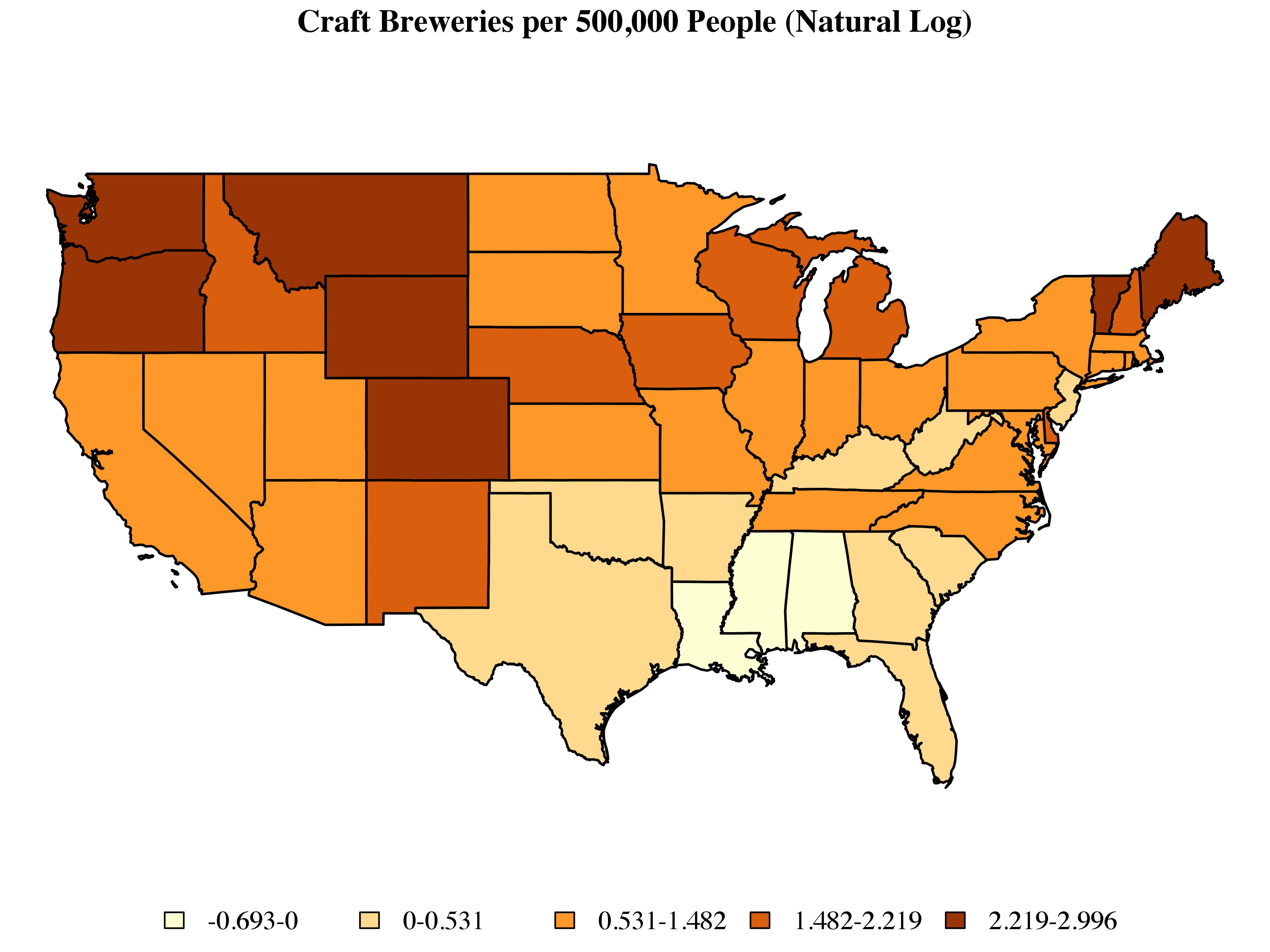
There are a couple of points to note here. First, I’ve omitted Alaska and Hawaii. Disconnected observations can become a bit of a headache when working with some of the methods described below. There are ways around this, but for the purposes of this post I’d prefer to set these issues aside. Second, instead of dealing with raw counts, I’ve taken the log of the number of craft breweries per 500,000 people. Finally, I’ve used Jenks classification to sort states into five categories, each of which is associated with a color determined by the ColorBrewer routine implemented via the brewer.pal command include as part of R’s RColorBrewer library.
Just looking at the map, we can see clusters of high-craft-brewing states in New England and the Pacific Northwest, as well as a large cluster of low-craft-brewing states in the South. We can begin to quantify these patterns by using a set of exploratory techniques designed to capture the extent to which observations which share similar values on a given outcome also tend to share a similar spatial location.
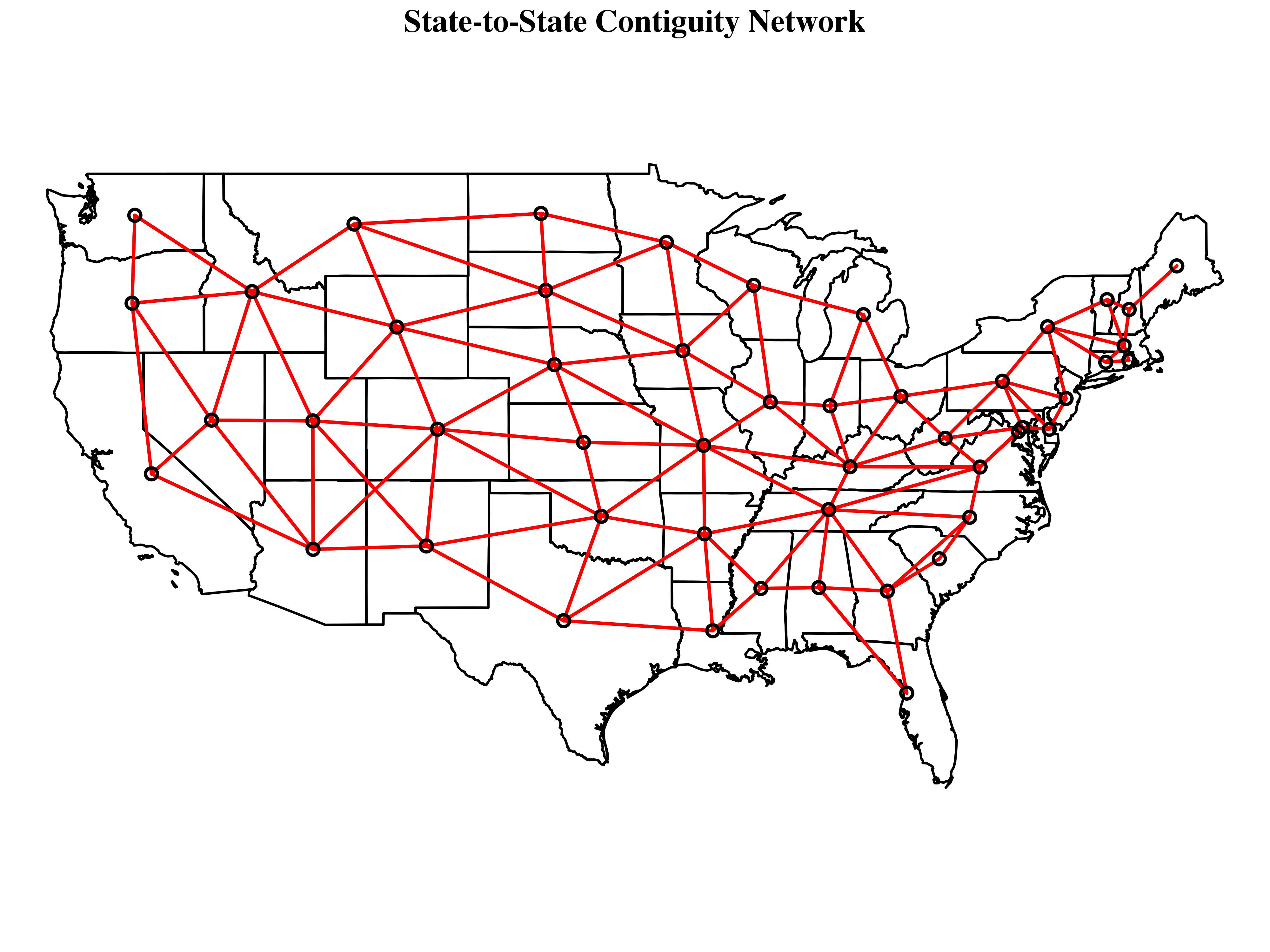
To get at the idea of spatial similarity, we use what is known as a spatial weights matrix, an  matrix used to represent the relationship between pairs of observations. A spatial weights matrix is really no different than the types of one-mode data matrices we see in network analysis were we typically represent relationships in terms of either (a) their presence or absence (i.e. through binary ties) or (b) their strength (i.e. through valued ties). While ties between spatial entities can easily be defined in terms of continuous measures such as inverse distance, in fields such as sociology it is more common to see first-order contiguity measures which, in the least restrictive case (known as “queen” contiguity), indicate whether or not two entities share at least a common vertex, if not a common border. By convention, we don’t allow self-ties.
Taking the United States as an example, a simple first-order queen contiguity matrix can be represented as follows:
If we take a standardized variable  , we can begin to get at the relationship between spatial similarity and value similarity by graphing the relationship between and
  . Here we use the term
  to represent a spatial weights matrix which has been row-standardized such that
  . To get a row-standardized weights matrix, all we have to do is take a matrix such as the one described above and divide each cell by the corresponding row total. For example, if we started with a first-order queen contiguity matrix in which each cell represents the presence or absence of a tie between any given pair of states
  and
and  , we could produce a row-standardized version of the same matrix by simply dividing all of the entries in any given row by the total number of ties across the row as a whole which, in this context, is equal to the total number of states adjacent to the observation associated with the row in question. Each entry now represents observation ‘s share of the total number of observations said to be tied to observation .
The use of row-standardization means that for any given state, the term  is going to equal the average value of across the set of observations surrounding the state in question. The use of matrix algebra in the form of the term
  is just a quick way of calculating an
  vector of local averages associated with the corresponding to the vector . To use a food analogy, is akin to a set of doughnut holes, while is akin to the corresponding set of doughnuts.
After first converting data on the number of breweries per 500,000 people to a -score and row-standardizing the binary contiguity matrix used to construct the map above, I then constructed the plot shown below:
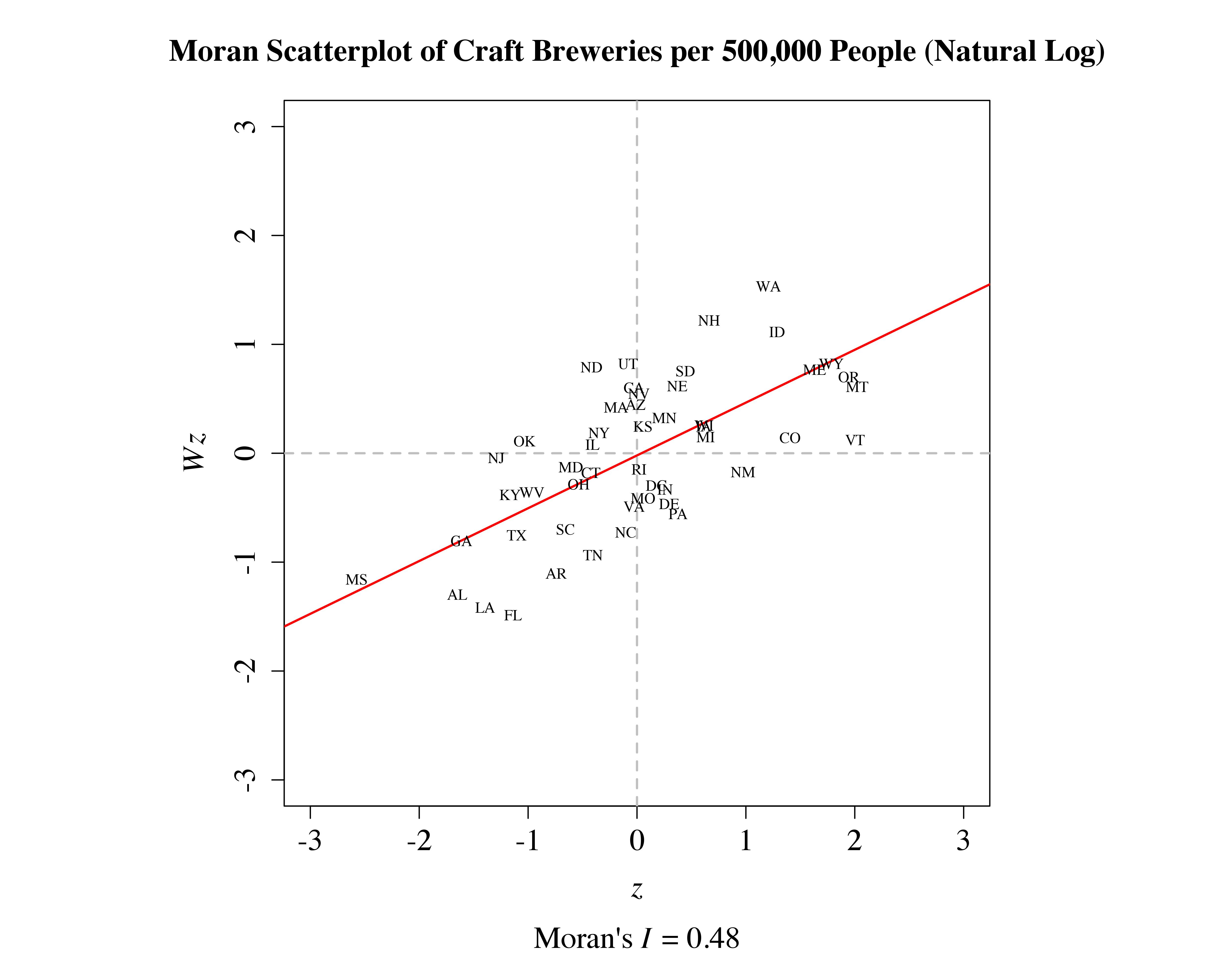
Whereas the  -axis represents the value of in any given state, the
  -axis represents the average value of across the set of states neighboring the state in question. The actual positions of the observations have been jittered in order to improve readability.
It is evident from the graph above that states that have a high number of breweries per 500,000 people tend to be surrounded by states that also have a high number of breweries per 500,000 people, meaning that craft brewing tends, on average, to be comparably prevalent in states occupying a similar spatial location. This type of graph is known as a Moran scatterplot because the slope of the regression line depicting as a function of is equal to the value of Moran’s  , a standard measure of spatial autocorrelation (see Anselin 1996). We can test the significance of Moran’s I using either a conventional parametric test or a Monte Carlo procedure. The degree of autocorrelation observed here is significant in both cases.
The coolest thing about Moran’s I is that it in addition to serving as a global measure of autocorrelation, it can also be decomposed into a set of local, case-level statistics  that collectively sum to the original global measure, such that
  . As discussed by Anselin (1995), the local Moran statistic falls into a more general class of statistics known as local indicators of spatial association, or LISA statistics, which measure the extent to which any given observation contributes to the global pattern. We can use a series of significance tests to identify observations that disproportionately contributes to the magnitude of the global measure with which the LISA in question is associated. A significant LISA statistic can be variously interpreted as evidence of either (a) the clustering of similar or dissimilar values, or (b) local instability with respect to the global trend. With this in mind, it it worth noting that when a global measure such as Moran’s is significant, this does not necessarily imply the existence of a significant LISA statistic, in that each observation could still contribute equally to the larger pattern. Conversely, it is possible to observe significant LISA statistics in the absence of global autocorrelation.
It is common to depict LISA statistics using maps such as the one below:
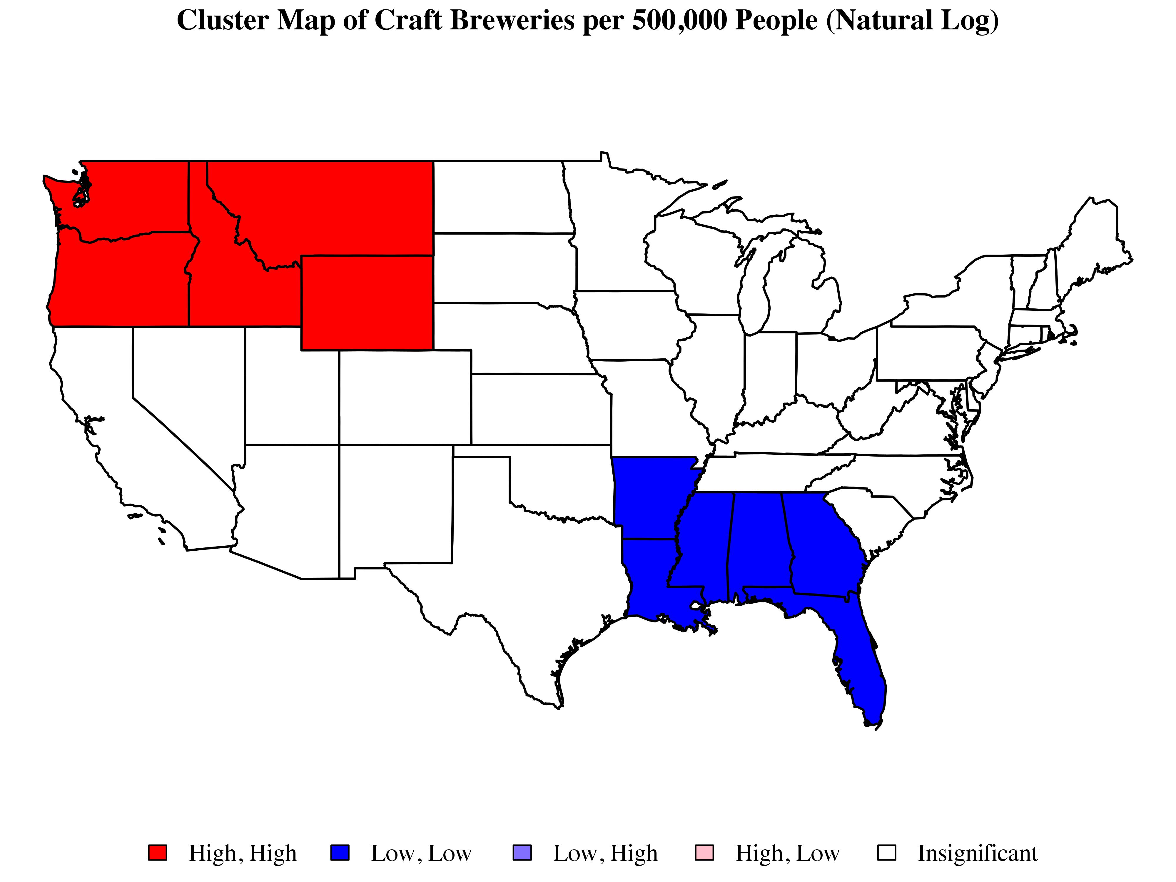
States are assigned to categories based on their position with respect to two sets of distinctions. First, we begin by determining whether the local Moran statistic associated with a given state is significant. Second, if the local statistic is significant, we then sort the state in question according to its value with respect to and . In practice, this is just a matter of determining where the state falls on the Moran scatterplot. States falling in the top-left quadrant of the scatterplot (i.e. states with low values on that are surrounded by states that tend to have high values on ) are coded as “low, high”; states falling in the top-right quadrant of the scatterplot (i.e. states with high values on that are surrounded by states that also tend to have high values on ) are coded as “high, high”; states falling in the bottom-right quadrant of the scatterplot (i.e. states with high values on that are surrounded by states that tend to have low values on ) are coded as “high, low”; and states falling in the bottom-left quadrant of the graph (i.e. states with low values on that are surrounded by states that also tend to have low values on ) are coded as “low, low”.
The cluster map shown above formally confirms the idea of a contrast between a cluster of high-craft-brewing states in the Pacific Northwest and a cluster of low-craft-brewing states in the South. As we would expect, these two clusters also appear at opposite ends of the Moran scatterplot, with the high-craft brewing cluster appearing at the far end of the upper-right quadrant and the low-craft-brewing cluster appearing at the far end of the lower-left quadrant. It is somewhat surprising that the New England cluster described above appears to drop out. When we look at the Moran plot, we can clearly see that Vermont, New Hampshire, and Maine appear alongside states such as Washington, Idaho, and Wyoming. Looking at the local Moran statistics along with corresponding set of significance tests shows that by conventional standards, New Hampshire is the only one of the three New England states mentioned here that comes close to having a significant statistic ( ). In the case of Maine, the magnitude of the statistic is reasonably high (as we might guess from looking at the Moran plot), but so is its estimated variance. All of this having been said, we don’t want to ignore New England; the Moran scatterplot clearly points to idea that there is something going on there. In this respect, the New England example nicely highlights some of the issues associated with reducing large amounts of information to a binary distinction based on statistical significance. This, of course, is a much bigger problem which becomes even more complicated in the context of areal data where standard assumptions about the existence of a repeatable data mechanism are brought into question (see Berk, Western, and Weiss 1995; Western and Jackman 1994). That’s an issue for another time. For now, let’s just keep moving.
So far we have seen not only that the prevalence of craft brewing in any given state is generally consonant with the level of craft brewing in neighboring states, but that this larger trend is disproportionately driven by the polarization between the Pacific Northwest and the South. Interestingly enough, this isn’t really a conclusion as such. Were I writing an academic article, this is where the story would be begin, in that the existence of global autocorrelation and local clustering are the things to be explained. In other words, the types of spatial diagnostics shown here are just clues in a much larger mystery.
Traditionally, the next step is to begin accounting for other characteristics of the observations in question through the use of some form of regression. The idea is that the degree of autocorrelation with respect to some output may have less than do with itself and more to do with the fact that is associated with some autocorrelated input . In other words, the similarities in across neighboring locales are actually explained by similarities with respect to the values of , as opposed to, say, an endogenous process in which outcomes spill over across neighboring locales. As we move into a regression framework, we begin to think about all of this in terms of residual autocorrelation—the amount of autocorrelation left in some outcome after accounting for the set of inputs  which may themselves exhibit autocorrelation. While a full analysis is well beyond the scope of a single blog post, I want to throw out some very preliminary “findings” (more like fun facts) based on having played around with some available data.
The analysis below uses linear regression to express the natural log of the number of breweries per 500,000 people as a function of five state-level covariates: gallons of beer consumed per capita (as reported by the Beer Institute), the presence or absence of commercial hop farming (based on data provided by the United States Department of Agriculture), the percentage of the population that identifies as Evangelical (as reported by the Pew Research Center), the natural log of the tax per barrel of beer (as reported in the Brewers Almanac compiled by the Beer Institute), and the presence or absence of a dry county (as reported by Frendreis and Tatalovich 2010).
Following the discussion in Gelman and Hill (2007: 56), continuous measures (i.e. gallons of beer per capita, percent Evangelical, and the natural log of tax per barrel) were standardized by first mean-centering and then dividing the resulting measure by two standard deviations (this allows us to interpret coefficients associated with the continuous inputs as if the continuous inputs were coded on the same scale as the binary inputs). Point estimates and 95 percent confidence intervals are shown below:

The story told by these models is fairly straightforward. I began with a simple bivariate model depicting the relationship between craft brewing and per capita consumption which, in this context, might serve as a rough proxy for demand. We find, perhaps not surprisingly, that there is a positive though somewhat noisy association between consumption and the prevalence of craft brewing. I then added controls for (a) the presence or absence of commercial hop farming and (b) the size of the Evangelical population. Together, these two variables might plausibly account for the spatial clustering observed in the Pacific Northwest and South, respectively.
We do see a significant reduction in the magnitude of residual autocorrelation between models 1 and 2, suggesting that on the whole, clustering with respect to the production of craft beer is largely accounted for by the clustering of hop production and religious affiliation, both which are strongly associated the prevalence of craft brewing, albeit in different ways. All other things being equal, the presence of commercial hop farming is, on average, associated with a higher prevalence of draft brewing. Conversely, we find that, on average, as the size of the Evangelical population goes up, the number of craft breweries per 500,000 people tends to go down. Interestingly enough, rerunning the LISA analysis shows that Wyoming, Louisiana, and Mississippi continue to show up as spatial outliers, as does Colorado. Only Mississippi falls into line after including the remaining controls.
I was initially tempted to focus exclusively on Model 2. Treating the log of the number of breweries per 500,000 people as the outcome, I find that I can account for around 85 percent of the spatial autocorrelation and roughly 45 percent of the variance using just three inputs. That’s not too bad. I was curious, however, about the nature of the Evangelical effect so I decided to include variables which might plausibly capture something about the institutional environment such as tax rates (Model 3) and restrictions on alcohol sales (Model 4). Looking at Model 3, we see very clearly that excise taxes are important. All other things being equal, the prevalence of craft brewing tends to go down as excises taxes go up. Note, however, that the inclusion of the excise tax variable on its own has little effect on the magnitude of the Evangelical effect. In contrast, when we add a control for the presence or absence of a dry county, as in Model 4, the effects associated with both the size of the Evangelical population and the size of the per barrel tax are cut in half, reaching the point of statistical insignificance, while the effect associated with the dry county variable is strong, negative, and statistically significant.
Evangelicals are, of course, not the only religious group that might matter here. The size of Catholic population also seems relevant. While the direction of the effect associated with religious composition changes, we actually see a very similar pattern of results if we replace percent Evangelical with percent Catholic:

The biggest difference is that until we get to the point of correcting for the presence or absence of a dry county, controlling for percent Catholic does not does seem to account for as much autocorrelation or variance as controlling for the size of the Evangelical population. Interestingly, if we include percent Evangelical in any of the models shown above, the Catholic effect becomes both negative and insignificant throughout with the remaining results staying more or less the same. The only notable exception is that the magnitude of the effect associated with the Evangelical variable tends to be somewhat larger than what we saw in the first set of models which did not correct for percent Catholic. Patterns of significance and insignificance with respect to the Evangelical variable are unaffected. Rerunning the LISA analysis indicates that Wyoming, Louisiana, and West Virginia are spatial outliers, even when correcting for the size of both the Evangelical and Catholic populations, along with the other variables included in Model 4.
While the results above make a lot of sense, I am hesitant to put too much weight on them. First, these measures are rough and there are probably other things to control for. Second, the models reek of endogeneity issues, in that we easily could imagine a feedback loop in which the growing prevalence of breweries contributes—either positively or negatively—to the magnitude of any one of the inputs. That is, we can swap any one of the inputs with craft brewing and still come up with a reasonable story about how variation in the input-turned-output follows from variation in the prevalence of craft brewing. For example, we could just as easily imagine hop farmers following breweries as we can breweries following hop farmers. The same goes for beer consumption and Evangelicals.
Finally, there are issues with the underlying data. Estimates of the percentage population that identify as Evangelical come from a 2007 study by the Pew Research Center which reported pairs of adjacent states as a single entity in cases where the sample size of one or both of states was too small. The affected state-pairs include Connecticut and Rhode Island, the District of Columbia and Maryland, Montana and Wyoming, New Hampshire and Vermont, and North Dakota and South Dakota. Each of these estimates probably represents something akin to the population-weighted average across the pair. Not only does this mean that our estimates for both members of the pair are going to be somewhat off from the true values, but the assignment of a single value to a pair of adjacent states is necessarily going to affect the degree of autocorrelation in the resulting variable. To the extent that the variable already exhibits positive spatial autocorrelation, the effect of assigning a single estimate to a pair of adjacent states should be relatively modest. The other notable issue with the religion data is that I have made no attempt to account for the fact that these are estimates derived from an individual-level sample.
I’m sure some of these problems can be fixed, but this felt like more than enough for the moment. Even if it doesn’t hold up as a real research question, I think it is a good teaching example. The data are kind of fun, plus it isn’t always that easy to find an example where you can actually for that much autocorrelation without turning to a spatial lag or spatial error model.