The graph above recently appeared as part of Scott Walker’s Twitter feed. Presumably, the idea is to suggest that under Walker’s leadership, Wisconsin has done better than the country as a whole when it comes to unemployment, though an alternative version of the ad makes it somewhat more personal, using the same basic figures to suggest that Walker—a Republican presidential candidate—is outperforming sitting Democratic president Barack Obama. In these ads, the Walker campaign repeatedly highlights the fact that the unemployment rate in Wisconsin is lower than the national average. Note, however, that the unemployment rate in Wisconsin was already lower than the national average when Walker took office. In other words, Walker inherited a good labor market. If we want to measure Walker’s effect on the Wisconsin economy, we need to look at changes in the unemployment rate over time.
I decided to throw some data at the problem. To put Wisconsin’s performance in perspective, I estimated the effect of time on the monthly seasonally-adjusted unemployment rate in each state. Covering the period from January 1, 2011 to June 1, 2015, the data came from the Bureau of Labor Statistics—the same source used by Walker and company. There are a number of different ways of estimating state-specific effects, the simplest of which is to disaggregate the data and run a separate model for each state. Alternatively, you can use a multilevel model which, in Gelman and Hill’s (2007) terms, allows for the partial pooling of data. Towards this end, I used the lmer command to estimate a simple bivariate model in which both the intercept and slope were allowed to vary by state. I am interested in particular in the slope parameters which capture the effect of time on unemployment. A negative slope indicates that, on average, the unemployment rate in a given state is going down over time. Much like the country as a whole, Wisconsin has a declining unemployment rate. The question is whether unemployment is declining faster in Wisconsin than it is elsewhere.
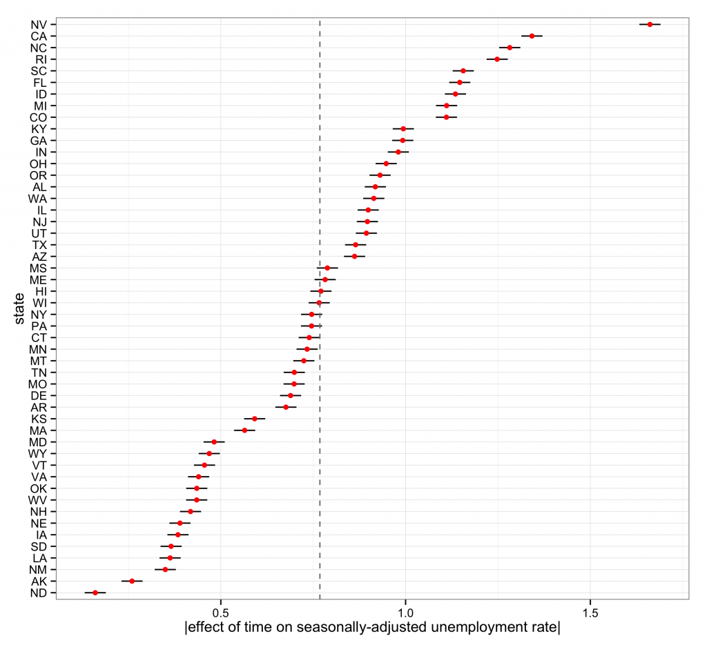
The figure above depicts the absolute value of the estimated slope parameters, along with intervals measuring ±1 standard error. Taking the absolute value of the slope is a quick way of reverse coding the estimates so that the graph can be read from left to right, with states on the right experiencing the most pronounced decline in unemployment (i.e. North Dakota is doing the worst and Nevada is doing the best). This only works because all of the slopes were negative. In effort to improve interpretability, I rescaled the time variable so that the slope parameter refers to the effect of a change of one year, as opposed to a change one month. For example, the absolute value of the time effect for Wisconsin is equal to roughly 0.77 which suggests that, on average, the seasonally-adjusted unemployment rate in Wisconsin dropped by 0.77 percentage points for each year Walker was in office. This seems pretty good, but when compared to other states, Wisconsin is decidedly average. The estimated effect of time on unemployment for Wisconsin is almost exactly equal to the value of the average slope, as shown by the dashed line.
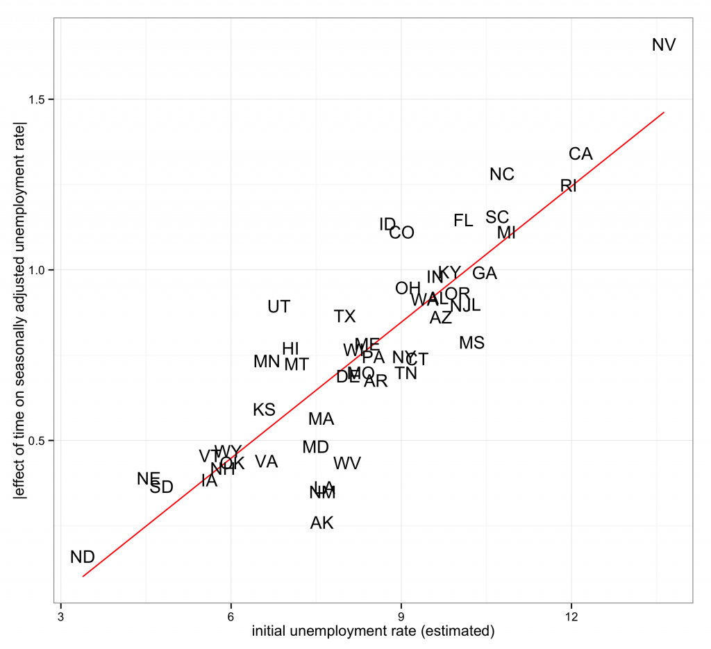
When it comes to changes in the unemployment rate over past four and a half years, Walker doesn’t seem to fare especially well when compared to his gubernatorial peers in the Republican field. Out of Christie (NJ), Jindal (LA), Kasich (OH), Perry (TX), and Walker (WI), the only candidate doing worse than Walker in terms of change in unemployment is Jindal. There’s an important caveat here, namely that the effect of time on unemployment is highly correlated with the unemployment rate at the start of the period. On average, the effect of time on unemployment was less pronounced for states that already had a low unemployment rate to begin with. In effect, its as if there is less room for these states to improve.
There are ways of modeling this directly, but a quick way of getting at the problem is to plot the absolute value of the estimated slopes against the corresponding intercepts which, by virtue of the way in which the time variable is coded, are equal to the estimated unemployment in each state as of January 1, 2011. As before, taking the absolute value here is a quick way of reverse coding the data after the fact. The results are shown below. You can see very clearly that states that had a high unemployment rate to begin with were the ones that tended to experience the most significant changes in unemployment over time. Indeed, the correlation between the two measures is 0.87. The same results hold if we disaggregate the data, run separate models for each state, and regress the resulting slope parameters on the initial unemployment rate observed in the original data.

What does this all mean? The most obvious conclusion is that insofar as it focuses on the difference between Wisconsin’s unemployment and the unemployment rate of the country as a whole, Walker’s ad is misleading. These differences cannot be attributed to Walker. If we want to talk about a “governor effect,” we should be looking at change over time. While the data above focus on states as opposed to governors, it is clear that over the course of Walker’s tenure, Wisconsin has been overwhelmingly average in terms of changes in unemployment. The results indicate that Wisconsin’s seemingly average performance is largely explained by the fact that it began the period in question with a fairly average unemployment rate. In other words, the changes in unemployment in Wisconsin were exactly what we would expect given the initial unemployment rate.
This is not to say that there is no room for a governor effect. The point is that the vast majority of state-level variation in changes in unemployment can be attributed to factors beyond the governor’s control. If there is a governor effect, it is likely quite small. I’m interested to see what real research on the topic shows.
UPDATE: R code below! I revised the original code to pull the unemployment data directly from the BLS site. It’s a little slow due to the fact that it’s grabbing multiple measures monthly going back to 1976. I’m also pulling the state codes directly from the BLS. As a result, the graphs produced by the code use full names instead of abbreviations which I had originally typed into downloaded data by hand. This works well for the slope estimates, but it makes the scatterplot a bit messy.
#LIBRARY
library(arm)
library(ggplot2)
library(dplyr)
library(readr)
library(tidyr)
library(stringr)
library(lme4)

#GET DATA
ue_url <- "http://download.bls.gov/pub/time.series/la/la.data.3.AllStatesS"
st_url <- "http://download.bls.gov/pub/time.series/la/la.state_region_division"
ue_full <- read_tsv(ue_url,
                    col_types = list(series_id = col_character(),
                                     year = col_integer(),
                                     period = col_character(),
                                     value = col_numeric(),
                                     footnote_codes = col_skip()))
st_codes <- read_tsv(st_url, skip = 1, col_names = FALSE, col_types = "ccc") %>%
  select(state_num = X1, state = X3)

#FORMAT DATA
d <- ue_full %>%
  mutate(month = extract_numeric(period),
         state_num = str_sub(series_id, 6, 7),
         series_num = str_sub(series_id, 20, 20)) %>%
  filter(series_num == 3 & !state_num %in% c("11", "72", "80")) %>%
  group_by(year) %>%
  mutate(rate_z = value - mean(value)) %>%
  ungroup() %>%
  left_join(st_codes) %>%
  select(state, year, rate = value) %>%
  filter(year >= 2011) %>%
  group_by(state) %>%
  mutate(time = (0:(n() - 1)) / 12) %>%
  ungroup()

#MODEL
mod <- lmer(rate ~ time + (1 + time | state), d)

#PLOTS
coef_df <- coef(mod)$state %>%
  mutate(time = abs(time))
se_time <- se.ranef(mod)$state[, 'time']
state <- rownames(ranef(mod)$state)
plot_df <- coef_df %>%
  mutate(state = reorder(state, time),
         lb = time - 1 * se_time,
         ub = time + 1 * se_time) %>%
  arrange(state)

#slopes
ggplot(plot_df, aes(x = time, y = state)) +
  geom_segment(aes(x = lb, xend = ub, y = state, yend = state)) +
  geom_point(colour = 'red') +
  geom_vline(xintercept = abs(fixef(mod)[2]), linetype = 2, colour = 'grey50') +
  scale_x_continuous('|effect of time on seasonally-adjusted unemployment rate|') +
  theme_bw()

#intercepts vs slopes
ggplot(plot_df, aes(x = `(Intercept)`, y = time, label = state)) +
  stat_smooth(method = 'lm', colour = 'red', se = FALSE) +
  geom_text(size = 5) +
  scale_x_continuous('initial unemployment rate (estimated)') +
  scale_y_continuous('|effect of time on seasonally adjusted unemployment rate|') +
  theme_bw()

#CHECK RESULTS VS NO POOLING APPROACH
nopool <- coef(lmList(rate ~ time|factor(state), d)) %>%
  mutate(state = rownames(.)) %>%
  select(state, fe_cons = `(Intercept)`, fe_b = time) %>%
  left_join(plot_df)
cor(nopool$fe_cons, abs(nopool$fe_b))
ggplot(nopool, aes(x = fe_cons, y = abs(fe_b), label = state)) +
  stat_smooth(method = 'lm', colour = 'red', se = FALSE) +
  geom_text() +
  scale_x_continuous('initial unemployment rate (observed)') +
  scale_y_continuous('|effect of time on seasonally adjusted unemployment rate|') +
  theme_bw()


