This is a guest post by Randy Zwitch (@randyzwitch), a digital analytics and predictive modeling consultant in the Greater Philadelphia area. Randy blogs regularly about Data Science and related technologies at http://randyzwitch.com. He’s blogged at Bad Hessian before here.

WordPress Stats - Visitors vs. Views
WordPress Stats – Visitors vs. Views

For those of you with WordPress blogs and have the Jetpack Stats module installed, you’re intimately familiar with this chart. There’s nothing particularly special about this chart, other than you usually don’t see bar charts with the bars shown superimposed.

I wanted to see what it would take to replicate this chart in R, Python and Julia. Here’s what I found. (download the data).

Continue reading

This is a guest post by Monica Lee and Dan Silver. Monica is a Doctoral Candidate in Sociology and Harper Dissertation Fellow at the University of Chicago. Dan is an Assistant Professor of Sociology at the University of Toronto. He received his PhD from the Committee on Social Thought at the University of Chicago.

For the past few months, we’ve been doing some research on musical genres and musical unconventionality.  We’re presenting it at a conference soon and hope to get some initial feedback on the work.

This project is inspired by the Boss, rock legend Bruce Springsteen.  During his keynote speech at the 2012 South-by-Southwest Music Festival in Austin, TX, Springsteen reflected on the potentially changing role of genre classifications for musicians.  In Springsteen’s youth, “there wasn’t much music to play.  When I picked up the best beginner guitar, there was only ten years of Rock history to draw on.”  Now, “no one really hardly agrees on anything in pop anymore.”  That American popular music lacks a center is evident in a massive proliferation in genre classifications:

“There are so many sub–genres and fashions, two–tone, acid rock, alternative dance, alternative metal, alternative rock, art punk, art rock, avant garde metal, black metal, Christian metal, heavy metal, funk metal, bland metal, medieval metal, indie metal, melodic death metal, melodic black metal, metal core…psychedelic rock, punk rock, hip hop, rap, rock, rap metal, Nintendo core [he goes on for quite a while]… Just add neo– and post– to everything I said, and mention them all again. Yeah, and rock & roll.”

Continue reading

As ASA gets closer, so does the first ASA Datathon!

We’re on from 1pm August 15 through 1pm the 16th at Berkeley’s D-Lab. Public presentations and judging will take place at one of the ASA conference hotels, the Hilton Union Square, Room 3-4, Fourth Floor from 6:30-8:15 on August 16th.

We’ve got a new website up — asa-datathon.github.io — that’ll be updated as the event approaches. If you haven’t signed up yet, make sure you do!

Signing up will give us a better idea of who will be at the event and how many folks we can expect to feed and caffinate. We’re also going to give teams a week to get to know each other before the event, so signing up will allow us to make sure everyone gets the same amount of time to work.

If you’re interested, you are invited. We don’t discriminate against particular methodologies or backgrounds. We hope to have social scientists, data scientists, computer scientists, municipal staffers, start-up employees, grad students, and data hackers of all stripes – quantitative, qualitative, and the methodologically agnostic.

Continue reading

With Season 6 of RuPaul’s Drag Race in the books and the new queen crowned, it’s time to reflect on how our pre-season forecasts did. In February I posted a wiki survey asking who would win this season before the first episode had aired. I posted this to reddit’s r/rupaulsdragrace, Twitter, and Facebook, and it generated an impressive 15,632 votes for 435 unique user sessions. Which means the average survey taker did a little under 36 pairwise comparisons.

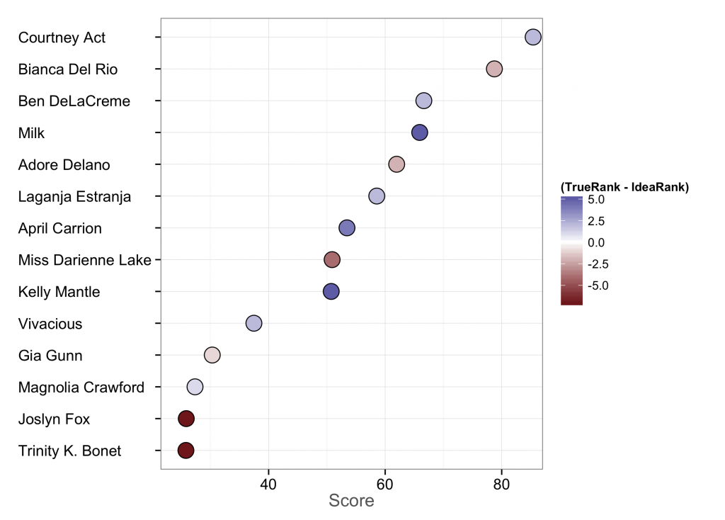
The plot below shows the results. The x-axis is the score assigned by the All Our Ideas statistical model and can be interpreted that, if “idea” 1 (or, in this case, queen 1) is pitted at random against idea 2, this is the chance that idea 1 will win. The color is how close the wiki survey got to the actual rank. The more pale the dot, the closer. Bluer dots mean the wiki survey overestimated the queen, while redder dots mean it underestimated them.

s6-plot

So how did the wiki survey do? Not terrible. Courtney Act was a clear frontrunner and had a lot of star power to carry her to the end. Bianca was a close second in the wiki survey and finally outshone her when it came to the final. These two are relatively close to each other in score. This was actually the first season in which two queens never had to lipsync. Ben DeLaCreme is ranked third in the survey, although she came in fifth. Little surprise she was voted Miss Congeniality.

After that, it gets interesting. Milk was ranked four by the survey, but came in 9th on the show. I’m thinking her quirkiness may have given folks the impression that she could go much further than she actually did. Adore, one of the top three, comes in fifth on the survey, rather close to her friend Laganja.

April Carrion and Kelly Mantle were expected to go far, but got the chop relatively early on. Darienne was a dark horse in this competition, ending up in fourth place when pre-season fans thought she’d be middling.

Lastly, Joslyn and Trinity are the biggest success stories of season 6. They had a surprising amount of staying power when folks thought they wouldn’t make it out of the first month.

So what can we learn from this? Well, for one, for a more or less staged reality show, I’m somewhat impressed by how well these rankings came out. Unlike using wiki surveys for sports forecasting, we have no prior information on contestants from season to season. Prior seasons give us no information about contestants (unless you consider something like “drag lineages”, e.g. Laganja is Alyssa Edwards’s drag daughter). All information comes from the domain expertise of drag aficionados. Courtney and Bianca were already widely regarded drag stars in their own right before the competition. Although this didn’t seem to be the case with other seasons, it seems like there was a strong Matthew effect at work this time. Is this the new normal as more well-known queens start competing?


This is a guest post by Neal Caren. He is an Associate Professor of Sociology at the University of North Carolina, Chapel Hill. He studies social movements and the media.

Folks like Jay Ulfelder and Erin Simpson have already pointed out the flaws in Mona Chalabi’s recent stories that used GDELT to count and map the number of kidnappings in Nigeria. I don’t have much to add, except to point out that hints to some of the problems with using the data to count events were in the dataset all along.

In the first story, “Kidnapping of Girls in Nigeria Is Part of a Worsening Problem,” Chalabi writes:

The recent mass abduction of schoolgirls took place April 15; the database records 151 kidnappings on that day and 215 the next.

To investigate the source of this claim, I downloaded the daily GDELT files for those days and pulled all the kidnappings (CAMEO Code 181) that mentioned Nigeria. GDELT provides the story URLs. Each different GDELT event is assocaited with a URL, although one article can produce more than one GDELT event.

I’ve listed the URLs below. Some of the links are dead, and I haven’t looked at all of the stories yet, but, as far as I can tell, every single story that is about a specific kidnapping is about the same event. You can get a sense of this by just look at the words in the URLS for just those two days. For example, 89 of the URLs contain the word “schoolgirl” and 32 contain Boko Haram. It looks like instead of 366 different kidnappings, there were many, many stories about one kidnapping.

Something very strange is happening with the way the stories are parsed and then aggregated. I suspect that this is because when reports differ on any detail, each report is counted as a different event. Events are coded on 57 attributes each of which has multiple possible values and it appears that events are only considered duplicates when they match all on attributes. Given the vagueness of events and variation in reporting style, a well-covered, evolving event like the Boko Haram kidnapping is likely to covered in multiple ways with varying degrees of specificity, leading to hundreds of “events” from a single incident.

Plotting these “events” on a map only magnifies the errors–there are 41 different unique latitudes/longitudes pairs listed to described the same abduction.

At a minimum, GDELT should stop calling itself an “event” database and call itself a “report” database. People still need to be very careful about using the data, but defaulting to writing that there were 366 reports about kidnapping in Nigeria over these two days is much more accurate than saying there were 366 kidnappings.

In case you were wondering, GDELT lists 296 abductions associated with Nigeria that happened yesterday (May 14th, 2014) in 42 different locations. Almost all of the articles are about the Boko Haram school girl kidnappings, and the rest are entirely miscoded, like the Heritage blog post about how the IRS is targeting the Tea Party.

Continue reading

I’ve been using R for years and absolutely love it, warts and all, but it’s been hard to ignore some of the publicity the Julia language has been receiving. To put it succinctly, Julia promises both speed and intuitive use to meet contemporary data challenges. As soon as I started dabbling in it about six months ago I was sold. It’s a very nice language. After I had understood most of the language’s syntax, I found myself thinking “But can it do networks?” Continue reading

Sadly, we haven’t posted in a while. My own excuse is that I’ve been working a lot on a dissertation chapter. I’m presenting this work at the Young Scholars in Social Movements conference at Notre Dame at the beginning of May and have just finished a rather rough draft of that chapter. The abstract:

Scholars and policy makers recognize the need for better and timelier data about contentious collective action, both the peaceful protests that are understood as part of democracy and the violent events that are threats to it. News media provide the only consistent source of information available outside government intelligence agencies and are thus the focus of all scholarly efforts to improve collective action data. Human coding of news sources is time-consuming and thus can never be timely and is necessarily limited to a small number of sources, a small time interval, or a limited set of protest “issues” as captured by particular keywords. There have been a number of attempts to address this need through machine coding of electronic versions of news media, but approaches so far remain less than optimal. The goal of this paper is to outline the steps needed build, test and validate an open-source system for coding protest events from any electronically available news source using advances from natural language processing and machine learning. Such a system should have the effect of increasing the speed and reducing the labor costs associated with identifying and coding collective actions in news sources, thus increasing the timeliness of protest data and reducing biases due to excessive reliance on too few news sources. The system will also be open, available for replication, and extendable by future social movement researchers, and social and computational scientists.

You can find the chapter at SSRN.

This is very much a work still in progress. There are some tasks which I know immediately need to be done — improving evaluation for the closed-ended coding task, incorporating the open-ended coding, and clarifying the methods. From those of you that do event data work, I would love your feedback. Also if you can think of a witty, Googleable name for the system, I’d love to hear that too.

For my dissertation, I’ve been working on a way to generate new protest event data using principles from natural language processing and machine learning. In the process, I’ve been assessing other datasets to see how well they have captured protest events.

I’ve mused on before on assessing GDELT (currently under reorganized management) for protest events. One of the steps of doing this has been to compare it to the Dynamics of Collective Action dataset. The Dynamics of Collective Action dataset (here thereafter DoCA) is a remarkable undertaking, supervised by some leading names in social movements (Soule, McCarthy, Olzak, and McAdam), wherein their team handcoded 35 years of the New York Times for protest events. Each event record includes not only when and where the event took place (what GDELT includes), but over 90 other variables, including a qualitative description of the event, claims of the protesters, their target, the form of protest, and the groups initiating it.

Pam Oliver, Chaeyoon Lim, and I compared the two datasets by looking at a simple monthly time series of event counts and also did a qualitative comparison of a specific month.

Continue reading

Michael Corey asked me to post this CfP for a conference “Demography in the Digital Age,” occurring at Facebook the day before ASA (August 15). Note that this is the same day as the ASA Datathon, but if you’re a demographer this looks very cool.

On August 15th 2014, Facebook is sponsoring a conference on data collection in the digital age. Planned for the day before the American Sociological Association meetings in SF, the conference aims to bring together faculty, grad students, and industry professionals to share techniques related to data collection with the advent of social media and increased interconnectivity across the world.

Continue reading

I’m excited to say that Sociological Science, the new general audience open-access sociology journal, has published its first batch of articles. These include a great set of pieces, including one from my collaborator Chaeyoon Lim on network effects and emotional well-being. But the article “The Structure of Online Activism” by Lewis, Gray, and Meierhenrich caught my eye, for obvious reasons.

I’ve got some thoughts on this article, and following the philosophy of Sociological Science of encouraging “ex post corrections/comments over ex ante R&R demands,” here’s my response, which I’m also posting as a formal response on the Sociological Science site.

Continue reading