This is a guest post by Randy Zwitch (@randyzwitch), a digital analytics and predictive modeling consultant in the Greater Philadelphia area. Randy blogs regularly about Data Science and related technologies at http://randyzwitch.com. He’s blogged at Bad Hessian before here.

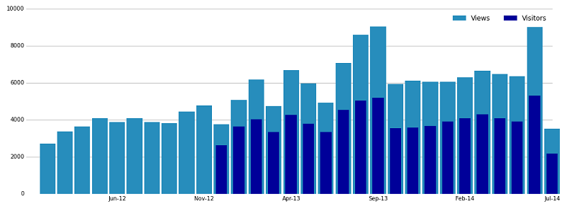
For those of you with WordPress blogs and have the Jetpack Stats module installed, you’re intimately familiar with this chart. There’s nothing particularly special about this chart, other than you usually don’t see bar charts with the bars shown superimposed.
I wanted to see what it would take to replicate this chart in R, Python and Julia. Here’s what I found. (download the data).
R: ggplot2
Although I prefer to use other languages these days for my analytics work, there’s a certain inertia/nostalgia that when I think of making charts, I think of using ggplot2 and R. Creating the above chart is pretty straightforward, though I didn’t quite replicate the chart, as I couldn’t figure out how to make my custom legend not do the diagonal bar thing.
The R Cookbook talks about a hack to remove the diagonal lines from legends, so I don’t feel too bad about not getting it. I also couldn’t figure out how to force ggplot2 to give me the horizontal line at 10000. If anyone in the R community knows how to fix these, let me know!
 (Pythonistas: I’m aware of the ggplot port by Yhat; functionality I used in my R code is still in TODO, so I didn’t pursue plotting with ggplot in Python)
R: Base Graphics
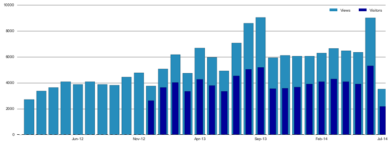
Of course, not everyone finds ggplot2 to be easy to understand, as it requires a different way of thinking about coding than most ‘base’ R functions. To that end, there are the base graphics built into R, which produced this plot:  While I was able to nearly replicate the WordPress chart (except for the feature of having the dark bars slightly smaller width than the lighter), the base R syntax is horrid. The abbreviations for plotting arguments are indefensible, the center and width keywords seem to shift the range of the x-axis instead of changing the actual bar width, and in general, the experience plotting using base R was the worst of the six libraries I evaluated.
Python: matplotlib
In the past year or so, there’s been quite a lot of activity towards improving the graphics capabilities in Python. Historically, there’s been a lot of teeth-gnashing about matplotlib being too low-level and hard to work with, but with enough effort, the results are quite pleasant. Unlike with ggplot2 and base R, I was able to replicate all the features of the WordPress plot:
Python: Seaborn
One of the aforementioned improvements to matplotlib is Seaborn, which promises to be a higher-level means of plotting data than matplotlib, as well as adding new plotting functionality common in statistics and research. Re-creating this plot using Seaborn is a waste of the additional functionality of Seaborn, and as such, I found it more difficult to make this plot using Seaborn than I did with matplotlib.
To replicate the plot, I ended up hacking a solution together using both Seaborn functionality and matplotlib in order to be able to set bar width and to create the legend, which defeats the purpose of using Seaborn in the first place.
Julia: Gadfly
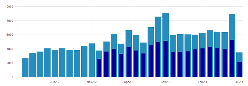
In the Julia community, Gadfly is clearly the standard for plotting graphics. Supporting d3.js, PNG, PS, and PDF, Gadfly is built to work with many popular back-end environments. I was able to replicate everything about the WordPress graph except for the legend: While Gadfly took a line or two more than base R in terms of fewest lines of code, I find the Gadfly syntax significantly more pleasant to work with.
Julia: Plot.ly
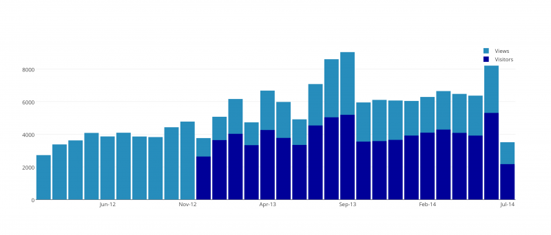
Plot.ly is an interesting ‘competitor’ in this challenge, as it’s not a language-specific package per-se. Rather, Plot.ly is a means of specifying plots using JSON, with lightweight Julia/Python/MATLAB/R wrappers. I was able to replicate nearly everything about the WordPress plot, with the exception of not having a line at 10000, having the legend vertical instead of horizontal and I couldn’t figure out how to set the bar widths separately. 
And The Winner Is…matplotlib?!
If you told me at the beginning of this exercise that matplotlib (and by extension, Seaborn) would be the only library that I would be able to replicate all the features of the WordPress graph, I wouldn’t have believed it. And yet, here we are. ggplot2 was certainly very close, and I’m certain that someone knows how to fix the diagonal line issue. I suspect I could submit an issue ticket to Gadfly.jl to get the feature added to create custom legends (and for that matter, make the request of Plot.ly for horizontal legends), so in the future there could be feature parity using these two libraries as well.
I hope we all agree there’s no hope for Base Graphics in R besides quick throwaway plots.
In the end, the best thing I can say from this exercise is that the analytics community is fortunate to have so many talented people working to provide these amazing visualization libraries. This graph was rather pedestrian in nature, so I didn’t even scratch the surface of what these various libraries can do. Even beyond the six libraries I chose, there are others I didn’t choose, including: prettyplotlib (Python), Bokeh (Python), Vincent (Python), rCharts (R), ggvis (R), Winston (Julia), ASCII Plots (Julia) and probably even more that I’m not even aware of! All free and open-source and miles apart from terrible looking Microsoft graphics in Excel and Powerpoint.
